20 Design Features That Will Make Your Blog Stand Out From The Crowd!
Hello Everyone,
Make Your Blog Stand Out From The Crowd!
Today we have a review of some of the additional design features you may wish to consider adding to your blog in order to make it visually more appealing and also to make for a better overall user experience.
I get a lot of emails about design – it appears most people can install a nice WordPress blog – especially when using the easy install feature that is available on the cPanel at Hostgator.com and adding themes such as those available at ThemeForest.net
However it appears a good number of you would like to Jazz up your Blogs – make them more striking and impacting. This post is for those people. For each feature we have suggested, we have also included a screen-shot of that feature in action on some of our favorite blogs.
Just one word of warning here — we are presenting you with 20 different features to consider, but this does not mean you should actually use all 20 features. I am a huge fan of customizing your blog and making it as individual to you as possible (bearing in mind literally 100’s or even 1000’s of people can be using the same Base Theme) – but as with most things in life, everything in moderation
And one final thought on design and customization – always ask yourself:
Does this Design Feature actually improve the User Experience?
And if you are running your Blog with the goal of making money then ask:
Will This Plugin, this Design Feature Help Me Make More Money?
If the answer to either of these questions is NO, then really you should not be doing it.
OH and as with all businesses, TEST, TEST, TEST
Every-time you add any new feature to your Blog you need to check how that new feature effects (improves) your conversions, wither that be sign-ups to a newsletter, affiliate commissions or sales of your products.
Enjoy the post – be inspired!
Best Wishes
Michael
PS: I am also aware a number of my readers, outsource all Blog Design work to their own tame Techie – go and impress them by suggesting they incorporate some of the features blow in the next redesign.
+++++++++++++++++++++++++++++++++++++++++++++++++++++++++++++++++++++++++++
20 Ways To Make Your Blog Stand Out From The Crowd!
#1 Attractive Website Navigation
Having a noticeable website navigation that looks really really good can make your users explore your blog more.
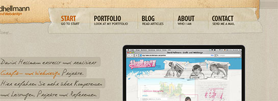
The Website Navigation That David Hell Mann Uses
* * * * *
#2 Splash Header
In Freelance Switch’s header, they mention the most important parts of their blog and use it as a kind of splash area to make sure people go in the directions they want them to. Here at IncomeDiary we do the same sort of thing on our homepage, we mention our most important content and give brief intros to the most important pages on the site.
* * * * *
#3 Have A Fantastic Footer
Your probably thinking whats the point, no one looks at the bottom of my site. But its surprising how many people actually do. That’s why having a decent ending to your blog is a nice touch.
* * * * *
#4 Next & Previous Posts Feature
Once you read a blog, you are often wondering where to go next, if you enjoyed the post, you definitely want more. With WebDesignerWall, they have a simple customization that sends people to the previous or next post, a great addition every blogger should consider to make their blogs stickier.
* * * * *
#5 Use a Popular, Breaking & Featured Widget
The sidebar can very often become cluttered up with un-useful widgets and text. That’s why merging some of it into one widget can be the solution. Having a widget that features Popular, Breaking and Featured posts can be really handy, and encourage user interaction.
* * * * *
#6 Feature Your Best Post Within A Slider
Having a best post slider on your homepage with nice big splash images can really be a good way to greet your visitors. This way, they can see the best content, and catch up on what they have missed out on since they last visited your blog.
* * * * *
#7 Create a Custom Heading Using Typography
Using a custom font and colours that make headings stand out can work wonders on your blog.
* * * * *
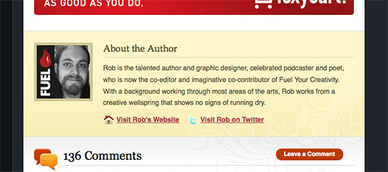
#8 About The Author
When someones finished reading a post, its nice to display a small Author bio. Nothing too long, but its better that just having “Posted by Rob”. A small avatar can make the bio look good too!
* * * * *
#9 Add a Breaking News Feature
Breaking news is a really cool idea that gives content urgency and importance. This could work for any type of blog that offers up to date content.
* * * * *
#10 Add a Popular Posts Feature Within Your Content
When listing your forever growing archive of blog posts, its nice to display something that “breaks” the list up. Having a popular posts bar is a perfect idea to break up content. And it can gain you more traffic too!

Popular Posts Are Listed Within Content On The Web Designer Depot Homepage
* * * * *
#11 Author Comments
Admin comments should stand out because you have something important to say that people should take note of, UxBooth have done a great job at customizing theirs!
* * * * *
#12 RSS And Twitter Count
Displaying your Twitter and RSS count can be handy, especially if its big. You can display this anywhere on your site, and design something nice and subtle, or big and bulky that shows your count off. Personal touches like this can make a good blog great.
* * * * *
#13 Use a Collage as a Background
Using a collage style background can really make your website stand out. Many websites do it, but only some do it well. You don’t want an insane collage that distracts readers from the content.

The Collage Background That Mash Kulture Uses
* * * * *
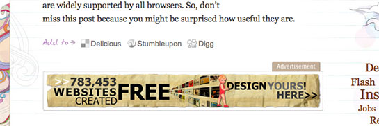
#14 In Content Adverts (That Fit The Site Design)
If you want to keep your advertisers, why not make their ads stand out more?
* * * * *
#15 Comment Style
Having a good comment style that looks good, appealing and fits your design can really make your users comments stand out that little bit extra.
* * * * *
#16 Sidebar Adverts
If you accept advertising then the Sidebar is a great place to put them and if you have the traffic you can earn you a nice sum of money – but please make them fit in with your design. Don’t make them look like an afterthought!
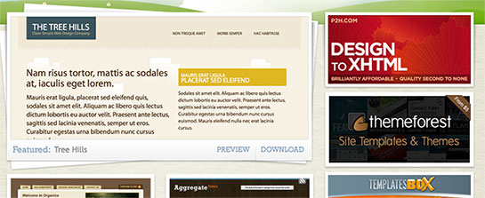
Open Source Templates Use In Design Sidebar Adverts
* * * * *
#17 Top Search Bar
I hate it when I’m on a really great website, and I go to search for something and I can’t find the search-bar. Having a big search-bar that doesn’t take peoples eyes away from the main design, but is easy to find is a real winner, and can take your blog from being good to great.
* * * * *
#18 Favicon
Using a distinctive favicon is important. I know its only 16px x 16px, but those 256 pixels are valuable real estate, so you want to design your favicon with thought.
* * * * *
#19 Quotes In Blog Posts
Everyone quotes things when writing on a blog. Styling your quotes differently from the rest of the content is a key. This makes interviews look ten times better!
* * * * *
#20 Post Images
Selecting your post image is an important decision. After all, you want something for each post that stands out and makes readers want to click it. You can also style your post image with a border or some sort of foliage to make it work with your blog design.
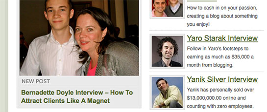
On IncomeSup, We Display Our Post Images With A Rounded Border & Padding
"Do Not Write Another Blog Post Until You Watch This Free Video..."

Watch this free video to learn...
- How I got over 10,000,000 people to visit my websites.
- The types of blog post that got me all that traffic.
- How to get someone else to do it for you!











Excellent post Michael, thanks for the tips. Working on a few designs at the moment, these tips will help out.
Thanks again.
Having those design is great for a weblog. But the problem is the cost to have those design. Especially when it comes to newbies who just begin to know about blogging stuff. The amount to hire designer and programmer to do that is cost them much. Do you have an advice for those who just want to set up a blog an have a good design for their blog? A simple and direct advice is just enough.
nice michael, I am going to build a website on my own, and your tips are really helpful, I’ll take some of them into consideration
Thanks Michael, working on setting up my first main blog at the moment (posting from HubPages just now) so this’ll help me out
These are truly great template features that make your blog stand out of the rest!
Excellent information! Thanks for shining the light and showing us the way Michael. Had been wondering about key design customisations, your post will be of great help certainly – thanks for the nice blog examples too…
Cool list, what is even better it is closely aligned with my own thoughts and design guidelines when I was implementing my last blog design last summer.
Thanks!
Great information! Some of these I have been wanting to add to my blog and a few I have never thought about. thanks for sharing such great information.
Cool tips michael, thanks so much!
Awesome post… just retweeted it to my followers
I like #10 because I always like to see the Author bios at the end of posts. Now I need to figure out how to do that on my blog…hmmm
Great post. I guess I’ve got some work to do on my blog!
Brilliant! this comes really handy. Cheers
Awesome post Michael. I’ll be working on a redesign of my site soon and you’ve pointed out a few areas that I would love to add.
Just would have been handy if you linked to a few of the plugins mentioned in the list! Nice blogs you previewed
Sarge | BeginnerBlogger.com
Great post! I’ve been pondering over how to redesign my blog for quite a while and this post has given me some excellent ideas!
I really liked a lot of those. Now I just need to figure out how to create many of them, haha. Cheers!
Very useful post Indeed! I’m starting to work closely with designers and coders on a full site re-design ready for next summer, these will come in handy.
I particularly like the idea of making author comments stand out from others. Thanks Michael.
thx for featuring my page.
All very good points!
And obviously good content.
Nice article. Cool points. Thanks Michael!
Really Good Post was thinking of writing about it but you have covered everything will use all these points while creating my professional blog
Another great post Michael. You are the man!!!!!
What a great post. I’m off to add to blog righ now! Thanks
These are excellent tips. Geesh my blog needs some serious work now. Lol. Thanks so much for the info.
Great post here. Now it’s just a matter of people integrating them to their existing theme.
Wow nice list of “flare” elements. Youre right about too much flare though…
These are some amazing tips, you’ve always got the best ideas at Income Diary. Keep up the great work dude!
Nice tips especially for me- newbie in wordpress.
Michael:
This is a remarkably useful compendium of ideas, as are a great number of previous posts.
Your blog is a wonderful resource I shall be sharing with my Published & Profitable authors, friends, and clients.
Roger
Nice selection of resources Michael,
I am actually in the process of completely revamping my blog – thanks for sharing.
I am going to build a new web site.Definitely your article will help me lot.Thanks Michael…
While i appreciate your tips, i however beg to differ. There’s nothing like minimalism, and yes minimalism pays. Why clutter just because you want to stand out?
Thank you for drawing so much attention to our design at UX Booth
Great Ideas overall! However, I’ve always believed less is more. Too much clutter and the user gets “sensory overload”. Too little and the user gets bored. So, there is a fine line when it comes to user functionality.
Thanx for the info,
Gianna
awesome tips Michael! Will implement some soon
great ideas!!!!!!!! awesome tips. thanks all the way.
Really great article, I will defiantly be implementing most of those soon…
One of my friend suggested to check out your website. I really happy to see articles that are really helpful
Thank you so much! I have bookmarked this article to use for my blog re-design.
I especially like number 5. I think clutter can be a website’s biggest enemy,
Thanks for the info, any ideas on how to improve my blog.
I always get really into the design stuff alot,
anyways good points.
Mikey
Hi Michael-
You have the epitome of a well designed blog.
I saw at WooThmes which template you started with, but yours looks nothing like it.
To create and develop something that looks like this from an original theme- how much work and money (mainly money) would I need to allocate to get to this level of design (looking for very rough estimates)
Any guidance would be appreciated.
Thanks for all you do.
Every original feature with a modern professional look will add credibility to your blog. Clean design builds credibilty and improves your search rankings. Credibility increases your readership and sets you apart immediately as an expert. I currently use a standard wordpress design but will look to upgrade to something more eye catching in the near future. Thanks for sharing these designs above with us Michael!
Hi Michael,
I just started out my paid blog by taking your free 7-day ecourse. I have a free blogger blog before but it’s just a waste of time after they suspended mine. Right now, I am trying to dress up my blog by reading and learning your post here. Thank you for help and hoping to copy your success in the future
Cheers,
Julius
Simply…amazing and useful post! Thanks for sharing this.