10 Different Ways I Use PopUp Domination At Once
I’ve been using PopUp Domination since I first started online, in early 2011, and since then, I’ve amassed a list of over 20,000 subscribers, most of whom signed up using PopUp Domination.
Since the early versions of PopUp Domination, the plugin has grown to include more themes, as well as shortcodes so that we can enter subscription forms about our website, such as in the footer and sidebar.
I use various themes from the premium theme pack at once, so that I can convert the most amount of visitors possible while keeping the offers relevant.
It’s helped me to build multiple lists, so I’ve written this post to show you the different ways I use PopUp Domination.
It may be more powerful than you realise – I use 6 different popups at once.
My Top Tips For Using PopUp Domination On Your Website
1. Exit PopUp Tool
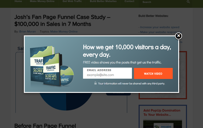
This is my go-to popup, and where most of my opt-ins come from. I’m constantly updating this with one of the 28+ themes available, to see which provides me with the best conversion rate.
It’s set so that when you leave my page, the popup appears, asking for your email address in return for a free ebook.
I A/B tested it earlier this year, and I found that I got a better conversion rate by asking for people’s email addresses as they were leaving, rather than when they land on the page.
It makes sense really because when they’re arriving on the page, they’re looking for something, and when you display a pop up straight away, they’re more likely to get rid of it and find what they came for.
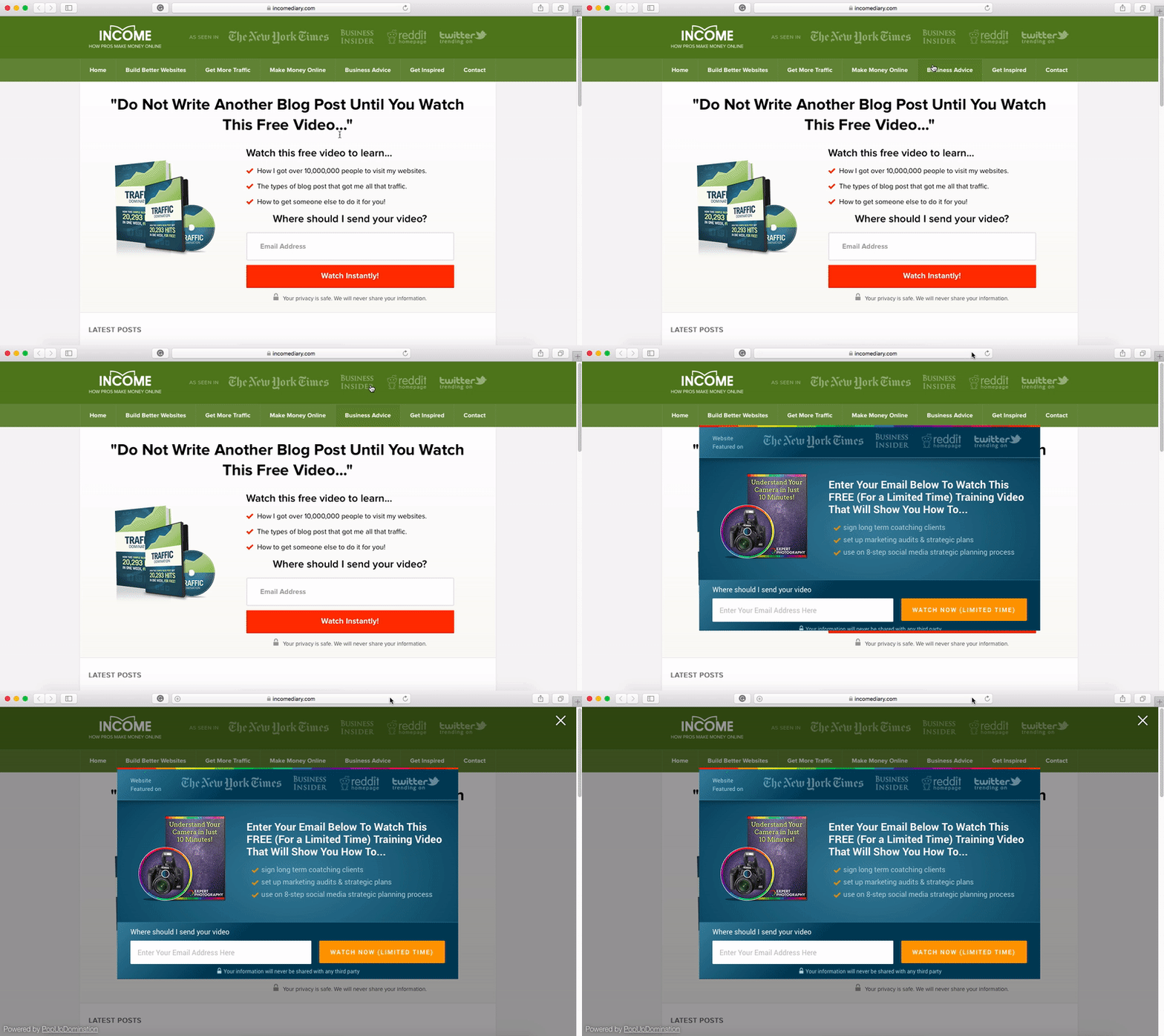
2. Display PopUp On Click
This feature is cool because instead of you choosing when the popup appears, the visitors does.
We have a free eBook teaching bloggers how to get more traffic. When we write blog posts about driving traffic to your website, we can add a link in the post that makes our popup appear, offering the free eBook.
Another option is, instead of using adverts to send traffic to your squeeze page, you can display your popup instead. This is great because, instead of a visitor having to load another page, they can signup straight away.

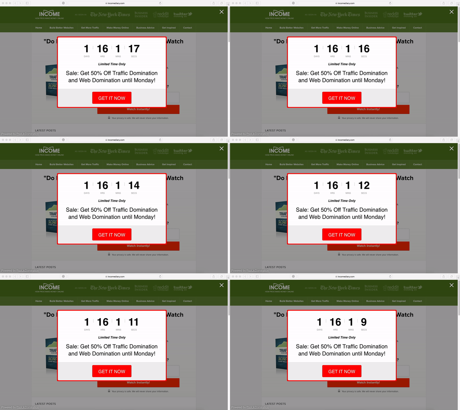
3. Countdown Sales PopUp
Every time I run a sale for one of my products, I add a count down popup to my landing page. This works great because it adds scarcity. People see it and think, this is a great offer and I don’t have much time to decide if I should buy it.
It significantly boosts conversions because visitors don’t want to feel like they missed out on a great deal!
I find that the first day and last day of my sale, I do the majority of sales and it’s because I have a countdown.
4. Mobile PopUp’s
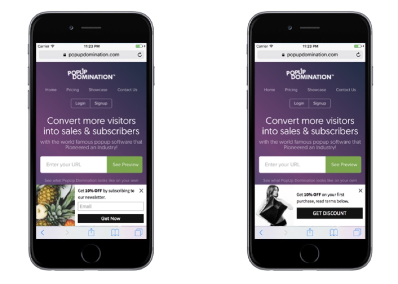
With version 4 of PopUp Domination, you can now display your popups only on mobile devices.
Also, all popup designs are fully responsive, which means they will change in size, depending on the device they are viewed on.
With over 30% of my traffic coming from mobile, this feature is very important!
5. Video PopUp
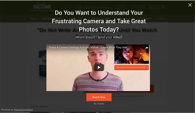
Sometimes, video just works best.
I have various video sales letters, from the short and sweet, to the 15 minute long informational videos, and it’s good to be able to display these videos on relevant pages.
For example, I recently created a 7-day video course, for free, to help promote my paid course. I had a video popup appear to visitors on the pages where the topics were mentioned, asking them to opt in.
This way, I can talk to them through the medium they will expect to see me though, and I’m only targeting relevant content.
It also means that I can use my regular popups on the other pages.
6. For Establishing Interest in a New Product Idea
This is an awesome trick, if I may say so myself.
I’m testing the market for a new course on composition because it’s not worth me creating the course until I know whether there’s interest or not. Otherwise, I’ll do months of work, for very little return.
I create a popup with a similar offer to the product that I’m going to create.
For me, I’m thinking about creating a photography composition product. So I created a popup, offering a free composition video I’d made, in return for their email address. Then I go into the Analytics in PopUp Domination and look at the conversion rate. If it’s good enough, I will create the course.
And if I do launch the course, I have a list of potential buyers.
I only make this popup appear in the composition category.
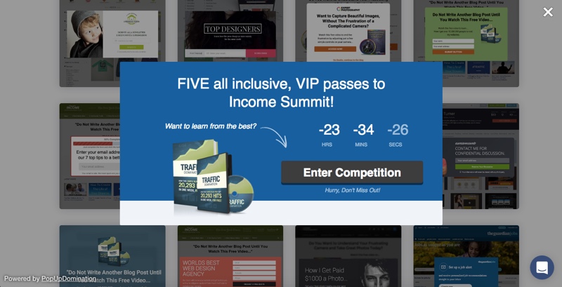
7. Using PopUp’s To Offer Discounts and Free Trials
One of the best things you can do for increasing conversions on a sales page is to offer a FREE trial or a discount.
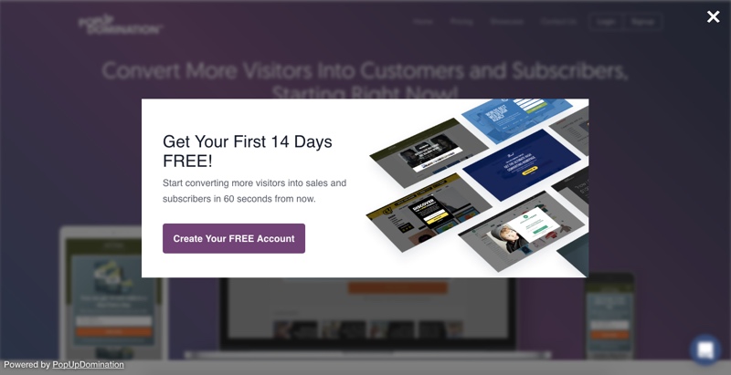
What we do is, we let visitors checkout our sales page, if they go to leave without buying, we show a popup offering them a free 14 day trial.
This converts very well for us!
8. Product Announcements PopUp
One of the most important things you can do when you run a membership website or sell software, is to keep it updated.
When you release updates, you want to tell everyone about it.
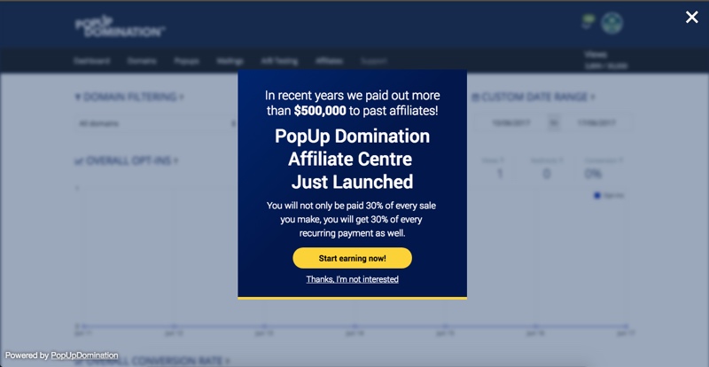
What I like to do is, add a popup, letting everyone know what the update is. This appears when a user logins in for the first time since the update.
Below you can see the popup we used to announce that we released our affiliate program.
9. PopUp Analytics Tool
If you work online, and you don’t know your data, then you’re just lazy.
One of the key ways to earn more money is to improve your conversion rate for more leads, or sales.
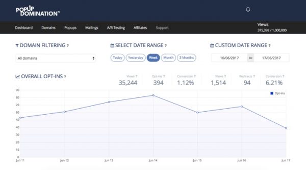
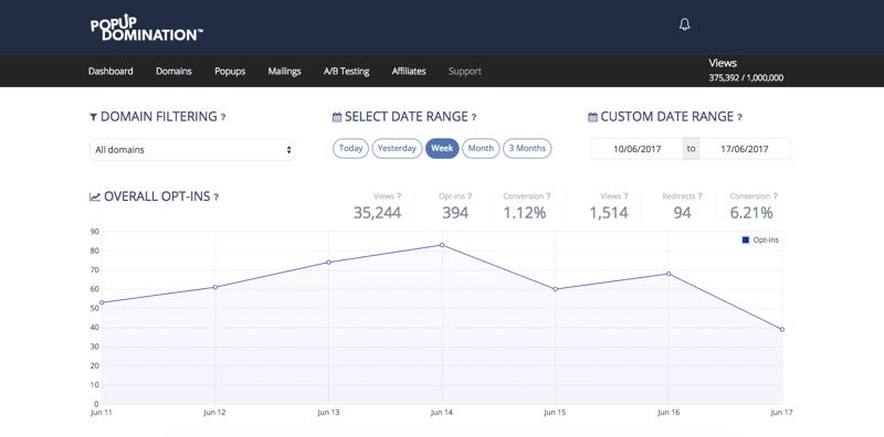
So for that reason, every page that could potentially lead to a conversion of some kind, is always being tested, and I’m always looking at the analytics.
PopUps are an incredibly powerful too, but you’ll never know how powerful it could be, without the use of analytics.
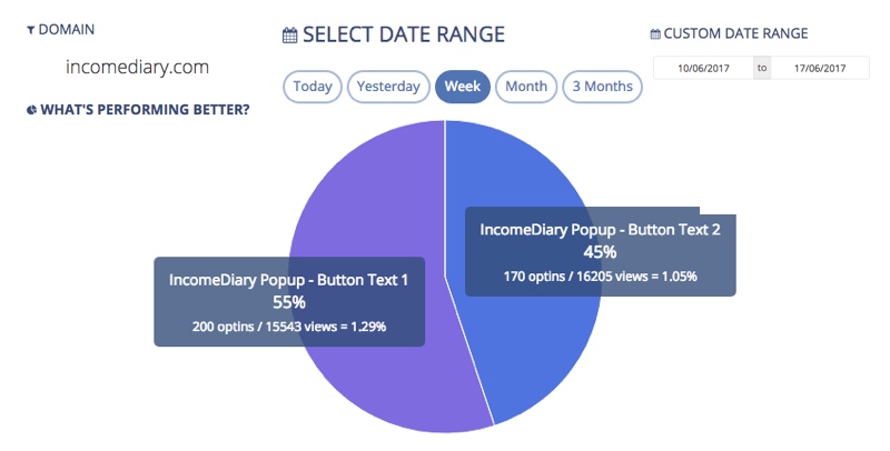
10. PopUp A/B Testing To Increase Conversions
Always be testing.
There’s always unlocked potential in your opt-in pages and popups, but you never know what’s going to convert best until you test it.
I initially tested a few different themes against each other, but when I found one I liked, that converted well, I then switched by making adjustments to one theme.
I test colour, heading, the length of bullet point, and my favourite point of all; button text.
To recap, here are some of my favourite PopUp Domination features:
Email Themes, Redirect Themes, Countdown Themes, A/B Testing, PopUp Triggers, OnClick PopUps, Exit PopUps, Analytics, Super Fast, Responsive Themes, Custom HTML/CSS/JS, Geographical Targeting, Page Specific PopUps, Referral Sites, Notification Popups.
As for my business, well my main source of income comes from my email list, so it makes sense for me to do everything I can to get more subscribers.
You may consider me to be bias, as the product was created by my brother, but I can say for certain that my business would not be where it is now without the use of PopUp Domination.
Along with OptimizePress, this is just one of the plugins that are essential to my business.
You can also follow PopUp Domination on Facebook and Twitter
"Do Not Write Another Blog Post Until You Watch This Free Video..."
Watch this free video to learn...
- How I got over 10,000,000 people to visit my websites.
- The types of blog post that got me all that traffic.
- How to get someone else to do it for you!


