9 Things Most Sales Pages Are Missing (fix these today to increase conversions!)
9 Things Most Sales Pages Are Missing…
So you’ve got your website up and your sales page is live with a great offer, but your visitors aren’t converting very well.
You’re looking at your traffic stats and comparing them to your sales, and you’re starting to feel disappointed and annoyed.
Could it be that your sales page is missing one or all of these 9 essentials?
I learned the hard way what not to do when selling products online and this article will help you understand how to dramatically improve your sales page conversion rate – even if you’re just starting out.
Today we’re going to look at nine things most sales pages are missing and why they’re destroying your conversions.
But before we get started, it’s probably a good idea to understand what exactly a conversion rate is. Some of our readers are so new to making money online that they’re not even clear on this point.
What is a Conversion Rate?
A conversion rate is the percentage of your prospective customers who follow through with a specific action you want them to take. For instance, a website can track the following kinds of conversion rates based on the amount of visitors the website is receiving:
- The percentage of website visitors who call the company.
- The percentage of website visitors that buy something from you online.
- The percentage of website visitors that fill out a form.
There are several ways to increase online conversion rates, let’s look at nine of them:
#1. Prove It
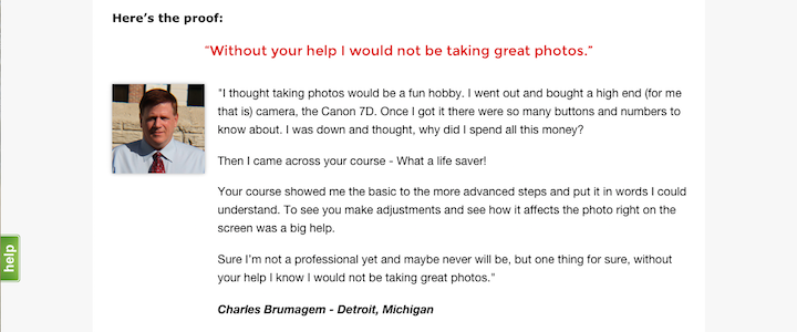
You can make claims about your business to your prospective customers, but they’re probably not going to swallow everything you feed them whole. In addition to your claims, always try and include social proof! Social proof might mean customer testimonials, 3rd party website reviews, and even case studies. Prove to your prospective customers that your existing customers are doing well.
I love the way the real life customer testimonials from ExpertPhotography.com fit so appropriately into their sales pages.
#2. Transparent Contact & Support Information
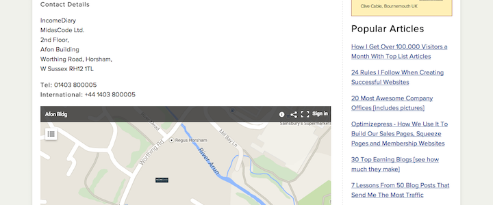
Having a telephone number, email support link, and live chat option can dramatically increase trust in a website. It makes it look like there’s a real business behind the website, and that there are real people to get in touch with.
IncomeSup makes getting in touch incredibly simple and obvious as you’ll see on the screen grab below…
I’ll let you in on a little secret… We hit record sales the very first day we used SnapEngage (live chat client) on one of our software websites. I highly recommend you try it for at least 30 days – it’s free.
#3. Credibility & Trustworthiness
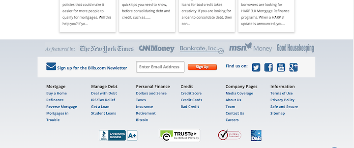
Showcasing “trust” seals from organizations like the Better Business Bureau and security firms like Verisign will almost always increase conversions. Again, this makes your website look like a serious business with serious validation.
Bills.com makes sure your eyes keep moving down the sales page and that their credibility sticks in your head as it’s the final thing you see on the page.
#4. 100% Customer Satisfaction Guarantee
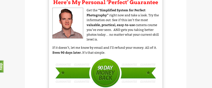
When you offer a guarantee, it gives customers a lot more confidence in what you’re selling. They know that they can get their money back if they find your claims aren’t true. Also, if you have a better guarantee, like 90 days compared to 30 days, then that will help too.
People want to know they can get their money back, and they want to know that they will have plenty of time to try out your service or product without any risk.
#5. Headlines
A headline is probably the first thing your visitors are going to see. It should compel them to read more, instead of exiting your site. If you can capture their attention with a headline, then you can keep them reading. If you can keep them reading, then you are more likely to convert them. Don’t underestimate how significant of an effect a good headline can have.
And here is something to remember…
“80% of emotional impact will be determined by the first 20% of the copy.”
Hire a seasoned copywriter just to write your headline, if that’s all you can afford. If you need additional inspiration, here are 10 great headlines examples that got us 10 million readers.
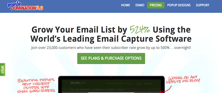
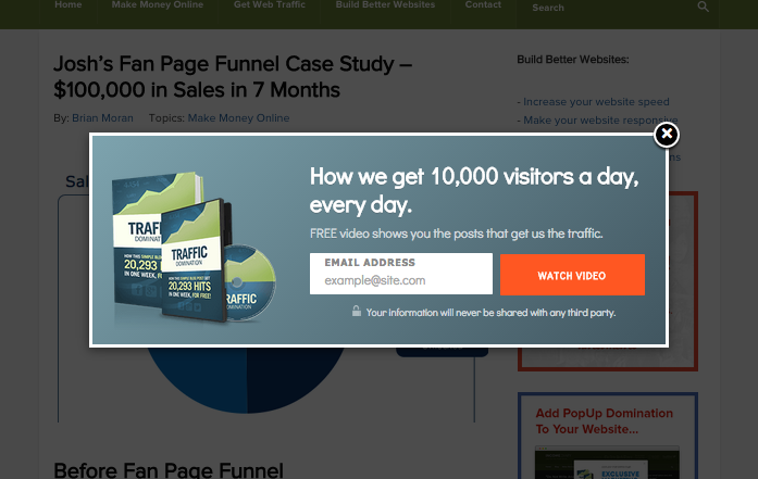
Here is a great example of a sales headline that PopupDomination used for years and years – that converted like crazy!
#6. Calls-to-Action
Even if you’ve gotten your web page visitors to stay on your website and read what you have to say, you still need them to buy. They might want to buy already, but that’s not enough. You have to make it really clear to them – how to buy, why they should buy, and that they should buy right now. Include a call-to-action at the end of your sales letter, or right near your purchase button.
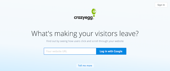
CrazyEgg.com has an incredibly simple landing page with a great call to action being the first thing you see. An extremely easy way to do this and make it look professional is with a nifty little software known as OptimizePress.
#7. Simplified Website Layout
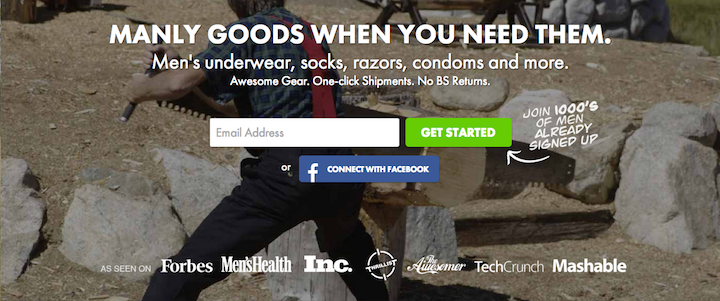
When visitors come to your web page for the first time, they want to be presented with a simplified website layout – not a whole lot of clutter, flashy graphics, or annoying distractions. Show them clear navigation and a straightforward sales path like the team at ManPacks.com, and you’ll have a better chance at making them stay.
OptimizePress is a WordPress plugin and theme that allows you to create clean and professional landing pages, membership sites and blogs, without having coding or design knowledge.
#8. TOS/Privacy Policy
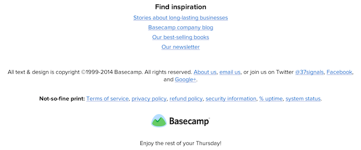
When you include a link to your TOS/Privacy Policy, it shows prospective customers that you take their private and financial information seriously. A trust seal at the bottom of the site, near those links, is even better. Show your prospective customers that you will protect their information just like Basecamp.com does with their “Not-so-fine print.”
#9. Social Media Builds Trust & Sales
Even if you don’t close a sale right away, if you build up your social media fan-base, followers, and friends, you’ll be able to interact with them on a daily basis. Giving away free content and direct interaction builds trust and will help you close future sales. Go for the long-term approach, don’t discount building up a list, a social media fan base, and an army of loyal blog followers if content marketing is a part of your overall sales strategy (it should be).
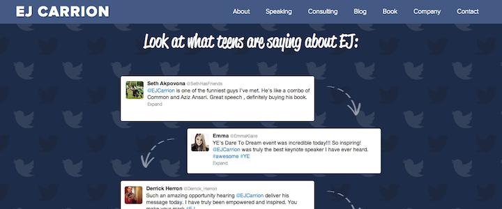
Proudly display your products, fan count and/or social shares to your existing fans and potential customers just like EJ does on EJCarrion.com
Word of warning, if you have a small social following, this method could end up hurting your conversions rather than improving them, so test it and see how it works for you.
Remember, having an intuitive and user friendly website can be the difference between a bounce and a conversion. For more ideas on how you can can increase conversions, check out the 7 website design features that will increase profits and usability.
-David Aston
"Do Not Write Another Blog Post Until You Watch This Free Video..."
Watch this free video to learn...
- How I got over 10,000,000 people to visit my websites.
- The types of blog post that got me all that traffic.
- How to get someone else to do it for you!



Hi David,
Love your article. There are a couple of suggestions on your list that I use already, but a couple of the others you suggest, I’d like to implement soon. Especially your pop-up domination. I want to test it on the exit … where I would respond to such as well.
Do you offer a side pop-up that is timed? I’m not exactly crazy about the in-your-face pop-up, but it depends on the content. Once or twice, I have responded to such. Mostly, I don’t.
Still, it’s a good idea to test a pop-up at some point. As long as it is not overdone, it may appeal to a segment of one’s audience … depending on the page topic and site content theme.
OptimizePress. sounds like something I should definitely try. Will let you know how it works for me. I’ll probably try that first off.
And I definitely need to make better use of social media. Just got my free product for lead gen completed, so then I’ll promote more on social. Friends have given me some interesting guidelines for Reddit and Pinterest in particular. Will share if you are interested.
Thanks again for this valuable information with examples … very helpful.
I agree you need to close the sale. One easy way is to join the Better Business Bureau and put their logo on your site. I would includes positive reives section on the site too.
Chris
Owner CEL Financial Services
Thanks for sharing. I’m in the process of writing a sales page and it has made my job so much easier.