20 Best Designed Pricing Comparison Tables
One of the most effective things you can do to help a customer buy from you is help them choose what to buy.
When you have multiple options for them to consider, the best way to help them make a decision is to communicate the differences between the various packages with a pricing comparison table.
Here are 20 of the best designed pricing comparison tables that will inspire you to create your own.
Aweber
 Aweber has done a good job of taking a complex pricing model – with monthly, quarterly, and yearly options coupled with subscriber pricing – and communicating it in an easy to understand way. They also simplify it by giving you the only option of signing up for just $1.
Basecamp
 Basecamp actually has five account options but they emphasize the three most expensive ones. When you hover over the details, they give you a more in-depth explanation so you can make an educated decision.
Crazy Egg
 Crazy Egg does a nice job of subtly emphasizing the plan they’d like you to sign-up for with nifty shadows that give it depth. Notice the call-to-action for all plans is to, “Sign Up Free.”
DIYthemes
 DIYthemes has a simple pricing comparison table for the Thesis WordPress theme. Obviously, they encourage you to sign-up for the Developer’s Option by putting it on the left and making everything larger.
Dropbox
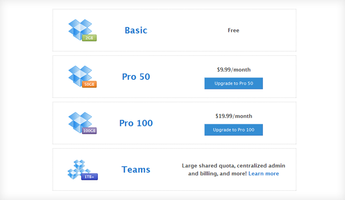 Dropbox also has a very simple pricing table that complements their simple pricing strategy.
Formstack
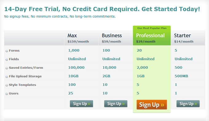 As soon as you see the Formstack pricing table, your eye is drawn to the Professional plan. Every other option is grayed-out while their most popular plan is their signature green. Also notice how the “Sign Up” button is larger, a different color, and the bottom of the button lines up with the rest of the table.
FreshBooks
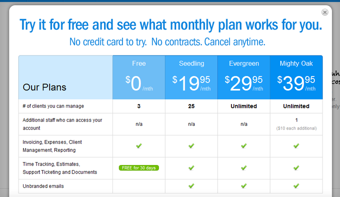 Similar to Aweber, FreshBooks has a pay-as-you-grow pricing strategy where you pay more as your business can afford it. No matter the plan you want, every customer signs up for their free trial.
HostGator
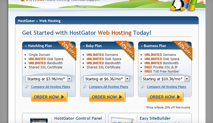 HostGator doesn’t have a particularly beautiful pricing table, but it communicates everything effectively. I like the drop-down menus that give you even more options.
LightCMS
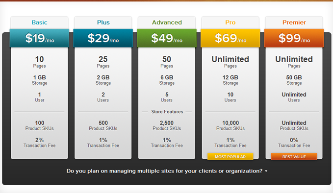 Contrary to HostGator, LightCMS has a gorgeous pricing table. Notice how they emphasize the features by bolding and enlarging the specifications so it’s easy to compare.
PopUp Domination
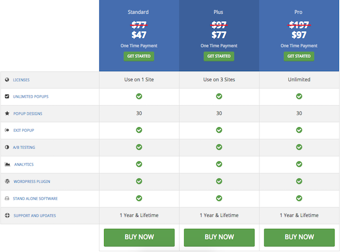
PopUp Domination also has a beautiful, yet simple pricing table with images, shadows, hover-overs, fancy typography, and bold red lines through the original price as savings reminders to encourage you to pay before the price goes up. Also notice how they split their plans up based on number of websites. If I’m an organization, I know which plan is best for me right away.
PandaStream
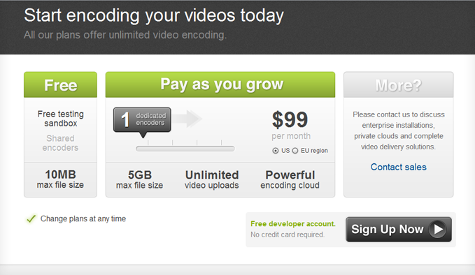 PandaStream has a neat pricing slider to show you how much their software will cost as your business grows.
Salesforce
 For a large company, Salesforce does a nice job of communicating their different packages for all of their different products.
Shopify
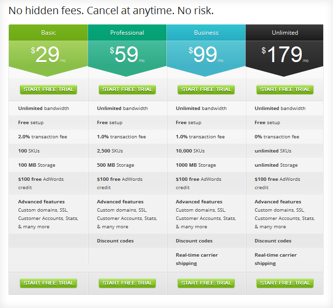 Shopify has, perhaps, the best designed pricing comparison table on the internet. Every option starts with a free trial which makes the decision simpler for their users and there are eight different places they can click to get started.
SlideDeck
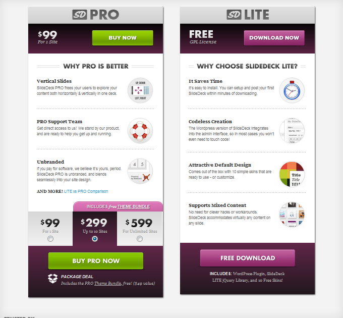 Similar to DIYthemes, they emphasize the pro option buy putting it on the left and including copy detailing, “Why Pro is Better.” The selection option at the bottom is also flawlessly integrated.
Squarespace
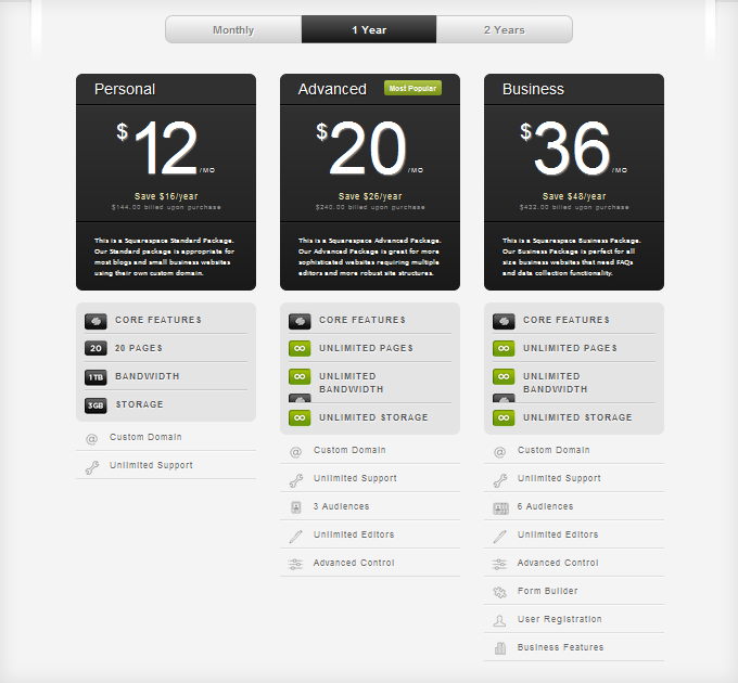 The nice thing about Squarespace’s pricing table is option to choose monthly, 1 year, or 2 years and the table updates without refreshing the page.
Typekit
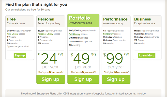 Similar to Basecamp, Typekit has five options and they emphasize three. And instead of offering monthly options, they require you to pay for a year upfront.
WooThemes
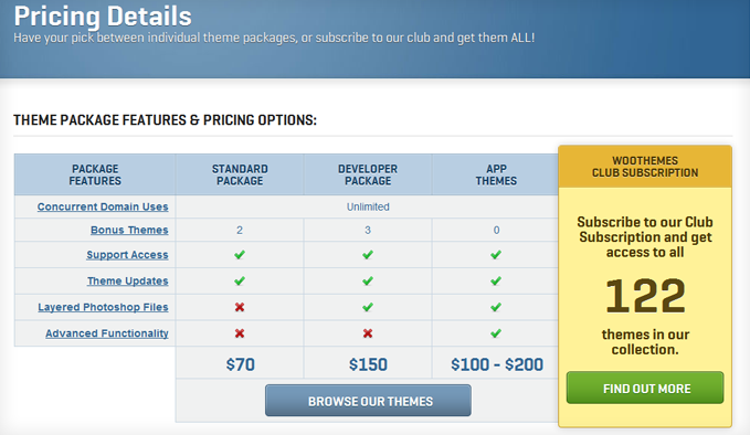 Which one do you think WooThemes would like you to sign-up for? Their table does a good job of communicating the differences between the various options and it’s obvious they want you to click the “Find Out More” button.
Wufoo
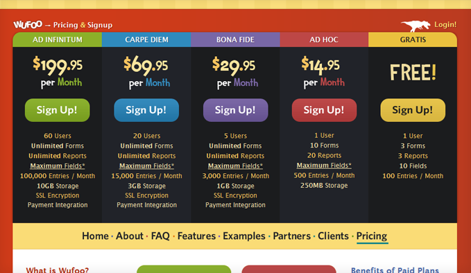 Wufoo has a notoriously swanky pricing comparison table. Unlike most tables, from left-to-right, they list the most expensive to the least expensive. This makes you look at the free option as the last resort rather than the starter package.
YepText
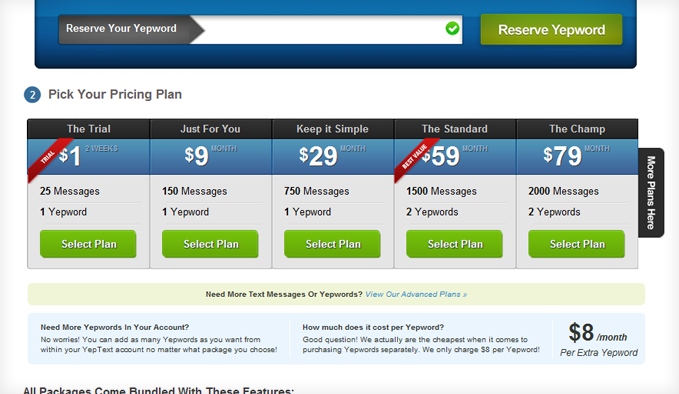 Our friend, Adam Horwitz, has done a wonderful job with his pricing comparison table at YepText. Headline, price, features, and call-to-action. Plus, they have even more pricing options if you click, “More Plans Here.”
Zendesk
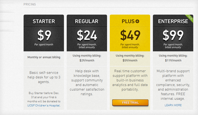 Zendesk takes the “Free Trial” option one step further by only offering it to people who sign up for their “Best Value” package.
Pricing Comparison Table Commonalities and Takeaways
- Free Trial – Get people started with a free trial or freemium pricing strategy.
- Button at Top and Bottom – Put the call-to-action at the top and bottom of the pricing table to make it easy.
- Best Value/Most Popular – Emphasize your best value or most popular option by making it slightly larger or adding box shadows.
- Hover-Overs – Clarify their questions and answer their objections with hover-over detail boxes when they hover over the features.
- Big Price – Make the different prices big.
- Call-To-Action Colors – Use a different, outstanding color for your call-to-action buttons.
- Pay-in-Full Pricing Options – Offer a discount to encourage them to pay for 1 or 2-year packages upfront.
What other pricing table commonalities do you see between these 20 examples?
"Do Not Write Another Blog Post Until You Watch This Free Video..."

Watch this free video to learn...
- How I got over 10,000,000 people to visit my websites.
- The types of blog post that got me all that traffic.
- How to get someone else to do it for you!




Great stuff, inspirational post for the designers [we guys!]
Thanks
I’m glad you liked the post, iDesigners! Which one was your favorite?
Great post today. It’s amazing how many large (Fortune 500) companies simply don’t get this. It’s incredible, but if they settle for less than stellar online marketing results, hey – more money for us lil guys.
I agree, Tim. Have you seen the Comcast pricing table? Blagh. Big companies make it so hard for us to make purchasing decisions and the only reason they’re around is because they’ve been doing it forever. I think we’re going to see a surge of small companies competing with corporations over the next decade or so.
Excellent post! perfect timing – thanks! I just bought a WSO graphix pak solely bc it had a couple of comparison tables in PSD format. I sell a physical product “system” and have 4 specific bundles I offer…so it gets confusing for people…and most times they really needed the more expensive bundle in the first place…but they found out after and had to upgrade after the sale.
your post made it easy for me to compare copy placed in the tables and calls to action. I have done free trials before…but its a headache with a physical product…so moved to a 1 year no questions guarantee…which is unheard of in auto care industry – my niche.
hi
A very interesting and useful post giving us lots of ideas and templates to copy change words of course
many thanks and have a great 2012
regards
peter mcgrath
The other nice thing about these tables is that many of them have been split-tested thousands of times so what you see is the most optimized version.
I love Aweber pricing chart. Beautiful color and theme
Yeah, their pricing table does a good job of representing their software in that it’s intuitive to use and you’re going to enjoy spending time on their site.
Nicholas,
Well laid out post. I’m a big fan of the Basecamp pricing table.
I’d like to see more small businesses taking advantage of these type of comparison pricing tables on their own sites.
Me too, Josh. It’s amazing how many times that pricing table has been featured in various case studies simply because the team at 37signals is so generous with their test results.
PandaStream and Shopify are the best in the list..
Perfect timing on this post I was just working to put together a pricing table for website packages on my site! I know there are some WordPress themes and plugins which create nice pricing tables with minimal design and coding required… I think it would be awesome to add a list of these option to the end of this post, or make another post on it.