7 Fast Fixes to Increase Your Website’s Conversion Rate
So now you’ve launched your very own product/service.
You’ve got your slick sales page up and running.
You’ve emailed your list, tweeted the link, posted the promotion on your facebook wall, scheduled a few webinars, published videos, set up some ads…
But it only resulted to sales far fewer than you imagined.
Put simply, you’re getting a lot of traffic but your conversion sucks.
What happened?
Wouldn’t it be awesome if you were converting more like these websites:
[/caption]
It’s not because these websites have super powers or because they’re using magic voodoo tricks. It’s simply because they’re doing things that you’re not doing – yet.
Conversion Optimization involves many things: market intelligence, developing hypotheses, split testing, measuring results, web analytics, etc.
In this article I’ll make things simple and give you 7 easy tips that if you apply to your sales process, will surely help improve your conversion rates.
1. Cover the Basics!
Just like you shouldn’t wear your pants before your underpants, it’s better to optimize your conversion rate after you’ve got the fundamentals right.
Start by ensuring your sales page or website is functional and accessible.
Functional
At bare minimum, make sure your site:
- Loads quickly
- Has no broken links
- Has a shopping cart that takes payments hassle-free and glitch-free
- Has data-capture forms that actually work (lead generation forms, ‘contact us’ forms, ‘request for proposal’ forms, etc).
Lets not forget about the backend and ‘customer fulfilment’ sides of your business; if a payment goes through but nobody in your team gets notified (due to a technical glitch or misconfiguration in your ordering system), you won’t be able to fulfil the order which could result to very unhappy customers. Not cool.
Accessible
Website accessibility refers to things like:
- The readability of your content. Evaluate your choice of font, font size, text color, background color, contrast between elements, etc.
- Site compatibility with popular browsers, including mobile devices like tablets and phones
- Loading times for different internet connections – will the dial up users in your audience have problems loading the site?
2. Know Who You’re Trying to Persuade
Ultimately, conversion optimization really boils down to how well you can persuade your prospects to take the action you want them to take. But you won’t persuade these people if you know jack shit about them.
Knowing the people you wish to serve is elementary stuff but are you really learning about them? Or are you just making assumptions, imagining what they must be thinking, arrogantly believing you know exactly what’s going on in their heads?
Go find out as much as you can about your niche market. Let’s say that your niche are Nazi-loving, one-armed, pregnant hermaphrodites (by the way I’m the market leader in this fast-growing niche so don’t even try to steal this from me). To effectively convert them into buyers, you must find out:
- What keeps them up at night?
- What’s their wildest fantasy?
- What are their biggest questions, their deepest fears, their worst doubts?
- What conversations are they having inside their head?
- What keywords are they typing in the search engines?
- What websites do they visit and why?
If you knew the answers to these questions, then:
- You would be able to come up with effective hooks to get their attention.
- You’d be able to produce the type of content they’d devour and pass on to their peers.
- You’d know exactly what questions they’d be asking at which stage in the buying cycle – and so you’d know how and when to answer.
- You’d be able to say the exact words that would trigger the needed emotions to help them decide and take action.
- You’d be able to put together an offer they simply won’t be able to refuse.
Conversion Optimization goes beyond the demographics and psychographics. If you’re serious about increasing your conversion, you must ask questions like:
What’s stopping people from buying? What are their buying criteria and how do they make buying decisions?
When a qualified prospect doesn’t buy, it’s rarely due to the price. Most often, a low website conversion rate is partly due to inadequate information. So explore what questions your prospects have that your sales page is not answering – then answer them persuasively!
Another cause of low conversion rate is that you haven’t clearly demonstrated that what they’re going to get is worth at least 3x the asking price. WIN-LOSE is the new win-win. If you make your prospects feel your offer is a WIN-LOSE situation (they ‘win’ because the value you’re giving is so great and you ‘lose’ because you must be out of your freakin’ mind to offer it at that price) then the investment becomes a no-brainer for them.
What made your existing customers buy? Exactly why are your happy customers happy? What do they think makes you awesome?
If you found out you’re a massive hit to your tribe because of your fast turnaround time or your competitive rates or your impressive portfolio or your amazing case studies (or whatever) – shout about these! From these you’ll find your core strengths, your unique value propositions, your unique positioning statements – so declare them, use them, proclaim them! Put them in places where your prospects will most likely find them helpful or influential to their decision-making process.
3. Serve Relevant Content
When a visitor lands on your site, the very first question they’ll have is: “Is this content relevant to ME?”
Every click that a visitor makes is made because they have a specific intention, they have a question they’re seeking to answer, or a need they want to meet. If they click a banner ad (for example) but your landing page does not satisfy their question, they will click away. This results to a high bounce rate.
Did you know that studies show visitors decide within 5 seconds whether your page is relevant to them or not? So you’ve a very short time to capture their interest!
To minimize bounce, create and maintain relevancy. Keep the consistency between the traffic source and landing pages.
For example, make sure the advert has similarities with the landing page in terms of the copy, the unique value propositions, the general look and feel, and of course the offer must be consistent.
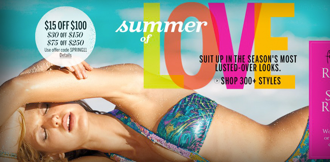
Looking at the banner ad below, the value propositions are:
- “Instantly adds 2 cup sizes”
- “Free Shipping on U.S. orders over $100 then there’s a code supplied (SHIPVS10)”
- “can be worn as crossback or halter”
Notice also the headline (“Hello Spring, Hello Bombshell!”) and the Call to Action (“Shop Now”).
Now pretend you’re a woman who wants to add 2 cup sizes to your figure. If you click this banner ad, you have certain expectations about what the landing page should present to you, right? But then it took you to this landing page:
I know it's hard, but try to notice the Value Propositions of the above banner ad
The banner ad took you to a page with a different tag line (“Dream Angels Forever”) – where is the “Hello Bombshell”?
Also now it talks about ‘needs a little lift’. If you’re the type of woman who felt compelled by the tagline, “instantly adds 2 cup sizes” do you think you would get excited by “need a little lift”? I don’t think so!
Also, the “Free Shipping for orders over $100” value proposition has been changed to “Free Shipping with any full priced bra purchase”.
Confusing, isn’t it?
You see there’s a massive disconnect there. No relevancy has been maintained. The continuity was broken.
You’d think it’s pretty common sense, but this happens a lot.
So if you have a high bounce rate (50% upwards), it’s likely that your campaign materials are failing to establish relevancy, or you have set up traffic sources that are attracting UNtargeted traffic.
When you design a banner ad or a PPC/PPV ad, when you write an email subject line, make sure you pair it up with targeted content. When you create a call to action, make sure the link takes them to a page with relevant content. When you promise to give a specific freebie, make sure the link takes the visitor to a page showing exactly the promised freebie and how to get it. Don’t be a douche by taking them to a sales page.
If your main traffic source are affiliates, you must educate your affiliates heavily about the importance of how they pre-sell your offer, what the best creatives to use for what situation and what link each creative must lead to.
4. Test your Unique Value Proposition (UVPs)
Unique Value Propositions are positioning statements or incentives that make your offer unique or extra attractive or gain more perceived value in the eyes of your prospects.
I’m sure you’re familiar with statements like:
- “Try it free for 30 days. Download now.”
- “Free shipping on orders over $35” or “Free shipping if you order today”
- “Instantly increase your opt-in rate by as much as 500%”
To increase your conversion rates, test which UVP is attracting the most number of clicks. For example, this campaign test was featured in Whichtestwon.com:
So you see, it’s worth experimenting on your UVPs! Try to use different value propositions:
- As hooks (place it above the fold to get the visitor’s attention, or as a slogan, or as subject lines in your email shots), or
- To convince your prospect why they should buy from YOU and not from someone else.
- As a way to lower the perceived risks of your offer (e.g., “use it for 30 days for just $1” ), or
- As a way to sweeten the deal (e.g., “If you buy from me I’ll throw in the following bonuses…”)
So don’t have a fixed UVP without testing how effective it is. Try to come up with new and better ones, especially as you learn more and more about your target market. You can even create UVPs for specific campaigns and then target a segment of your audience with that campaign (e.g., email a “Buy one get one free” offer to just those who opted in to your list during the last 2 weeks, or only to those who participated in a recent survey).
5. Create a Remarkable Customer Experience
Here’s what Jeff Bezos, founder of Amazon.com, said when asked what his key business strategy was that mainly contributed to Amazon’s success:
“We take those funds that might otherwise be used to shout about our service & put those funds instead into improving the service. That’s the philosophy we’ve taken from the beginning. If you build a great customer experience, customers tell each other about that. Word of mouth is very powerful.”
Jeff Bezos focused on building a better customer experience. In other words, rather than spending loads on advertising (a traffic generation activity), Amazon spends time and money on Conversion Optimization tasks, or things that happen when users get to their website and on things that happen after someone buys.
6. Sell the Benefits, NOT the Features
Think you know this already? If your website is boasting how you or your offer is the best, the brightest, the number one, the most {insert awesome adjective here} but not translating those into benefits (to the customer)… then you don’t get it.
Remember, your prospects’ favorite radio station is WII FM – “What’s in it for me?”
Regardless of what they tell you, most people make emotional (as opposed to logical) decisions, and this applies to buying decisions.
When you state features, they tend to sound gobbledygook to many people. You must translate those statements into concrete benefits.
Of course you will still need to make boring feature-rich statements like “This car has a boot size of 40 cubic feet”, but if you first say something exciting like “This car’s boot can easily fit in 4 dead adult bodies plus it’s got a built-in crematorium – making it super easy and convenient to get rid of incriminating evidence! Be untouchable – never get caught red-handed ever again!” then you’ll be a huge hit amongst serial killers.
My point is that you must use power-packed benefit-statements that effectively trigger the emotions that would most likely persuade prospects to buy.
7. Provide Point-of-Action Assurances (POAs)
Point-of-action assurances (POAs) are confidence-building elements right next (or very near) to your Call to Actions.
Getting POAs right involves anticipating the questions and objections or problems that your visitors might have while interacting with your site as they go through your sales funnel, and addressing these objections/problems/questions right at the point when they ask those questions or have those objections.
Here’s another example from Whichtestwon:
Which version do you think converted better?
The above is a screenshot of the improved version of a Hotel Booking page. The ONLY improvement made was adding FAQs on the right hand side of the page. Just by adding this Point-of-action Assurance, this page got a 9.2% increase in completed hotel bookings, which, as you can imagine is probably worth hundreds of thousands of increased revenue for this hotel chain.
Other POA ideas you can use are:
Another example is placing “Trust-inducing logos” right next to Call to Action button, like below:
Transparent and/or simple shipping calculations:
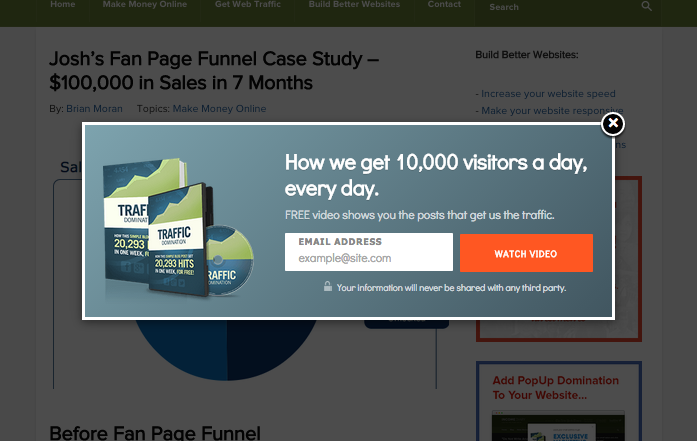
Product detail pop ups like in the Blog Creation Domination sales page:
Explanations Popup to Explain What Each Feature Mean
POAs like this Reassures the Prospect that it's Risk-free to Go Ahead
Conclusion
Conversion Optimization is not about manipulating people to do what YOU want them to do regardless of what’s best for them. Neither is it just a matter of randomly changing elements in your site like colors, shapes, sizes, layout and seeing what seems to be convert better.
Rather, Conversion Optimization is about truly knowing your prospect inside and out, aligning your offer with their needs, anticipating and answering their questions, and addressing their fears, uncertainties and doubts.
Apply the seven simple tips above and you’ll surely be ahead compared to many of your competitors. If you want to learn even more advanced Conversion Optimization principles for your website, join me on my next webinar: “Why Your Website Sucks and What to Do About It: How to Make More Sales Without Getting More Traffic”
About Marj Galangco
Marj Galangco is a certified Conversion Rate Optimization and Web Analytics Practitioner. She’s also the co-director of Easisell, a company offering premium web design and web development services to savvy internet marketers.
"Do Not Write Another Blog Post Until You Watch This Free Video..."
Watch this free video to learn...
- How I got over 10,000,000 people to visit my websites.
- The types of blog post that got me all that traffic.
- How to get someone else to do it for you!




Loving this post Marj, great job! I’m sure we all hope to see more from you as often as possible
Michael
It was an honor to get invited here, Michael. Thank YOU!
An epic post Marj with great tips AND great graphics Biggest take away for me… “Sell the benefits – not the features” & the importance of split testing. In your opinion Marj what are the best split testing/optimisation tools on the market today?
Hi Steve,
For starters I always recommend GWO (Google Website Optimizer) because it’s got pretty much everything a small biz will ever need to measure & evaluate their CRO efforts. Plus it’s FREE!
Another great tool for those who like a tool that has a more WYSIWYG (What-you-see-is-what-you-get) feel, Visual Website Optimizer is pretty nifty
Thanks Marj!
This is awesome! I just skimmed through the article and I find it interesting already. I see Incomediary taking a new twist and I love it.
Congratulaions Michael.
Now, I’m off to read the article :).
It still gets me how people don’t understand the importance of conversion optimization.
When I first read through your post I was thinking – “Holy shit, there’s so much value in this post for people who already have their own sales funnels in place!”
The sheer depth of the article is great for newbies to conversion optimization and I’m glad you’ve gone to the trouble to put it out there.
Great job and I anticipate this guide helping a lot of entrepreneurs and small businesses out there to sell more of their stuff!
I appreciate the love and support babe x
Here’s someone who really knows their stuff.
This is right on the money.
With great examples and how-to’s you’re giving valuable, practical, immediately apply-able solutions that anyone who is serious about higher conversions should implement now!
Thanks Clive! Glad a Master copywriter like yourself approve
Very informative article. Hard to believe Victoria’s Secret let that ad land on a page that is so irrelevant, but it just goes to show that it can happen to anyone – if you let it happen, that is!
Well to be fair Eric, I spotted it on a 3rd party site that looked like it was created by an affiliate. So no it wasn’t really Victoria’s fault
It’s just one of the downsides when you start bringing in affiliates in the picture.
Tops ! Thank you for sharing.
This blog is becoming my “bible”. Amazing content.
Michael, you deserve all the best for helping so many people.
WOWMarj, you hit this one out of the park!
Truly a viral piece of content if ever I saw one.
Thanks so much for sharing not only the detailed article with your experience, but also the screenshots as well.
Nice Catch Michael! Don’t go throwing this one back
Thanks so much, Alex. Glad you find it helpful!
I’ve read many sites that claim the tell you how to run your site but none of them come anywhere close to the kind of in-depth information I see provided on your site. keep up the GREAT work and I will be back for more info
Wow epic post indeed Marj!! It’s amazing how such small changes can almost double conversions!!
Thank you for these tips!
‘epic’ is my word of the day
This is great Marj… Maybe I can’t think of a better word but this post’s a bomb.
A lot of us sell features and not benefits. And I totally agree that creating trust makes people buy.
Thanks for this post
Yes Emmanuel, one very common mistake when trying to sell is to view the entire picture from our perspective as vendors.
To be truly persuasive we need to craft our materials based on the prospect’s viewpoint.
Thank you for your comment!
Those are some great tips. Putting what you call point-of-action assurances in place really helped my own conversion rates- but I got like 6 more things from your post that I need to implement.
Thanks again.
Awesome, Nate! Would love to hear your results later
I kept looking for the typos and grammatical errors, Michael, and didn’t spot any (pulling your leg) Cool idea to invite someone to post. Valid points throughout, especially regards ‘the disconnect’…
Haha to be fair I did get my partner edit it for grammar errors. I’m far worse than Michael!
Marj, I have to say you crushed it with this article. I’ve been in the ecommerce biz since 1997 and I have never seen this topic explained so simply and clearly. Well done! Great use of supporting graphics by the way
Don Scott Schnure
1AutomationWiz.com
Thanks Don, that made me smile
Would you agree that businesses are still just starting to explore CRO? Many are not even aware of it…
BTW – by ”great use of supporting graphics” you mean the Victoria’s Secret ads, right?
Brilliant post Marj! I have been looking into CRO for some time now, as we are definitely leaving a lot of money on the table in our own e-commerce business, and this is definitely one of the simplest and best presented articles I have come across… Well done!
Now I just need to stop talking about it and start split testing…
PS: I agree with Don about the great use of supporting graphics…
E-commerce site is the best type of website to do CRO with! I’m excited for you!
Brendon, just try to do 2-3 simple tests. I’d be surprised if after 3 successful tests you still haven’t joined Split Testers Anonymous.
You are funny Marj! But you are absolutely right… I can already see myself at STA twice a week… I am obsessive compulsive about everything web as it is… so I am scared to think I might start obsessing over yet another aspect of web development / e-Commerce / internet marketing…
Marj – Very well written and the “value added” is phenomenal. Thanks for sharing your knowledge.
Awesome tips Marj! Thank you.
Wonderful post Marj, those are great tips to increase conversion. I think having a good design and a fast loading site can also help to increase conversions!
True dat, true dat.
Michael is a great case-study actually because he’s always coming up with new ideas on how to improve his conversions AND speed up his site!
It is all about SPEED! The faster the site the better. By the way, how do you upload your picture in that little box Mr Clement? I don’t seem to have that option.
Simply go to http://gravatar.com and with register the email you use for commenting. After that, you can log into the service and upload photos to attach to the Gravatar.
Marj is like a Jedi Master. Hmmm…very good. Very very good. Consider this page bookmarked.
For some reason I’d been referred to as a Jedi Master twice this week already. How the hell did you know I’m short??!
Great tips! It is always safe and convenient to stick with the basics and do things the conventional way. It’s a matter of understanding your demographic and what works with them.
Damn, Doozie of a post there!
Re-tweeting that for sure and also checking out your blog on easisell (notice you have “8 tips…” on your most recent blog post, but this post is MUCH more detailed).
cheers
Haha yes, I made it EXTRA EXTRA special for you guys, see
Haha, love your dry sense of humour – The one armed nazi hermaphrodites and serial killer boot-space LOL Right up my alley.
Aside from that, gotta thank you a bunch for an amazingly useful blog.
Thanks Marj
And Michael, dude…you gotta be so proud of this blog – It’s just back to back value and quality! Truly awesome.
Finally! Someone who appreciates my dry sense of humor!
This is a good post it is helping me a lot since i am an apprentice.
Hi Marj,
I emailed your company yesterday but didn’t hear back.
Hi Ben, I replied to you just a few mins ago! Good timing, eh!
Hi marj, great insights. I do agree with studying your niche market not just to learn from them but to show your visitors that you well know your niche market. I like how you say sell benefits, not features. Some businesses fail on this.
Love this post Marj! One of my key takeaways from this post is “to know your audience”. The more you can know and understand about your audience and their needs, the more chances you’ll have to woo them into purchasing.
Also, testing is critical to understanding if your targeting ideas work or not. Depending on the amount of traffic your site receives be sure to perform A/B tests or multivariate tests on your concepts.
Love the random nazzi stuff and such, hah! Great tips and a conversion rate of 40% is just mind-blowing..
This is the most awesome article I have seen in a LONG time! Way to go Marj! For the WIN!
Well having those bombshells in the image itself is enough for having higher CTR.I dont think there would have been a conversion rate of 40% as mentioned by tarrum.
I think the format and presentation is important as well e.g. font size and colour of headings. Nobody wants to read something that is hard on the eyes. But a great post as usual.
Wow! I’ve been looking for information about conversion! and I’ve found a good info, but, THIS IS THE BEST!!! Im amazed! I didnt know those things! Thanksssssss for sharing this GOOD information!! Im gonna aply it to my business ! Regards!
Great tips here Marj!
My conversions on my niche website are pretty low (next to nothing) and I’m hoping by implementing these, I”ll see an increase.
Hi Micheal Love your stuff just bought pop up domination but purchased single license is there anyway to upgrade to multiple sites as really cool tool
Thanks for all good post -keep them coming
working hard on getting blog smart
cheers
Si
Hi Micheal
just bought pop up domination but purchased single license is there anyway to upgrade to multiple sites as really cool tool
cheers
Si
Hey Michael,
I’m a Popup Domination customer and I like your blog quite a bit.
In your post “How To Monetize a Blog” you say that the “recommended reading box” is the best converting box on your site and that you will share it with your fans. Could I get a copy please?
Also, I’m in the health and fitness niche and have one site that gets 8000 monthly visitors and another that gets 4500 monthly visits. Do you find that people make money in non-make-money-online niches as easily as in the MMO niche? Glen Allsop had an interesting video saying that many bloggers make money teaching others how to make money.
I could improve my conversion funnel to be sure… but I wonder if certain niches are more likely to generate sales than others.
Thanks,
Raza
Your niche could be huge, but have a very poor conversion rate. Your niche could be TINY, but have a HUGE conversion rate.
It’s all about how well you communicate your value proposition and how targeted your traffic is.
Also, if you sell 100 $10 items in a day, but you sell 100 $40 items in two days, where would you rather be?
Hi Marj,
Great job, you really did it well. :):) I will keep coming back to read your new post.. Keep safe Marj..
You have to have THE BEST information blogging site for the online and network marketer. Michael, I am having trouble finding good designers to fix, edit, improve the layout of the busybee theme like yours (pics, read more adjust, banner). Is there a series of howto’s your design can create for sale on fixing these.
1. I have woothemes
2. I have the basics
3. I have hosting
I just need a wooninja. I am even having trouble in the jobs.woo board
Love your 2nd point! I have taken a note of these questions and I’d like to add that all time spent analyzing your market is time invested. Once you begin to influence these wannabe buyers you can contact them to ask their opinions, desires etc – market research. Social media gives us this opportunity on an unparalleled level now!
Hey IMpopstar, try convince Michael to use Social Media on IncomeDiary. If you succeed I’ll send you some nice chocolates.
Great article! Very helpful for those who are just starting out in internet marketing.
Nice article Marj.You describe the whole thing in a simple manner.Learn lot of new things from your post.
Thanks Michael. So much to learn, but we will get there. Regards, Neil in London.
My favorite part of this post was the first tip about making sure the basics are done right. Well, that and the breastesess part. Hehehe
But far too many marketers, me included, are deluded by the sexy conversion elements and we forget to plug the holes that actually pay the bills.
This can easily fuel the “Shiny Object Syndrome” that’s so rampant today that causes people to constantly be looking for the new tool that promises to rescue them from poverty or mediocrity.
While the fundamentals may be boring, they are the backbone of your business and I’m so glad you’ve shared your awesome list here!
Cool post. my favorite is the victoria secret model. shes hot.
Everyone like to short cut and be superman which wear pants only wear underwear. That why they always miss out something that need to be done in the basic.
Content and Call to action play important conversion rate. One thing you keep me aware is benefit and not feature. Sometime i look too much on promotion about the feature. Until i find out that benefit content will improve the conversion rate as well.
try to use question to build interact while we know that website is more hard to create persuasive because it is one way communication.
An amazing article. It’s nice to read a quality blog post. I think you made some good points in this post.