

30 Best Designed Blogs of 2011
“Ooh, that’s different!” Yep, the latest Income Diary redesign brings the total number of major redesigns of this site up to five in three years. That’s how much emphasis Michael puts on having a good-looking, high-converting, content-promoting blog design.
If you need a designer or developer who could’ve started yesterday, go to AweseomeWeb.com
To commemorate the redesign and, more importantly, provide you with an inspirational list, I present to you the 30 best designed blogs of 2011.
The Criteria for Good Blog Design
To remove as much of the subjectiveness as possible, I started with these five good blog design criteria.
- Simplicity – Is it simple?
- Web Design Standards – Does it follow web design standards like dark font on light background, clearly distinguished headlines, use of CSS sprites, consistent lines, and golden ratio compliance?
- Attention to Detail – Is there consistency within the design and otherwise pixel perfect?
- Easy to Navigate – Could I easily find and use menus, links, and other navigational components?
- Memorability – Could I remember what it looked like after exiting the site?
30 Best Designed Blogs of 2011
In no particular order, but roughly grouped by the design styles and subject matters of the corresponding blogs, here are the top 30 blog designs of 2011.
1. Freelance Switch
Big, bold headlines, subtle use of shadows, and practically impossible to see gradients, FreelanceSwitch.com is one of the best.

2. Copyblogger
Copyblogger.com is the epitome of simple, solid, straightforward blog design. You know exactly where to click as soon as you land on the page.

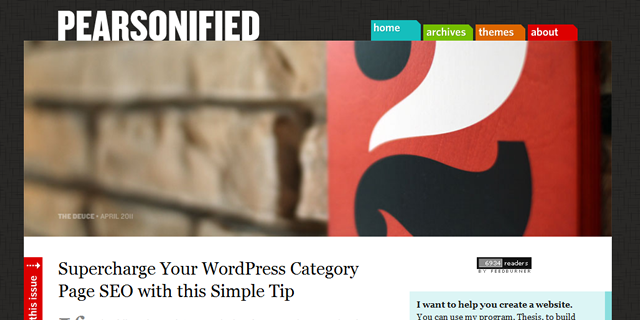
3. Pearsonified
Like Copyblogger, Pearsonified.com is beautiful in its simplicity and alluring with its gentle smattering of bright colors.
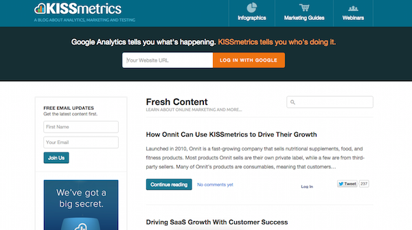
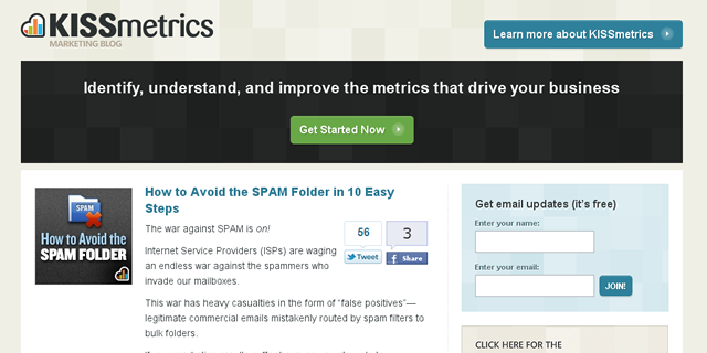
4. KISSmetrics Blog
The KISSmetrics Blog does a great job of combining modern design elements while maintaining a sense of professionalism for their mostly corporate target market.
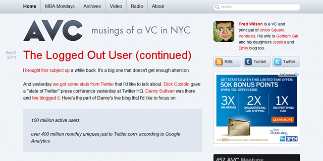
5. AVC
AVC.com is super-clean and, at 16 pixels, it uses a slightly larger than average font which makes it noticeably more pleasant to read.
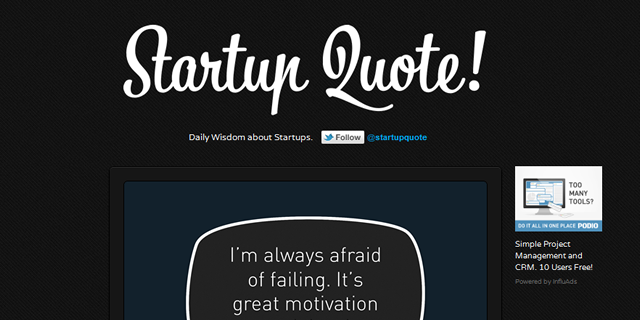
6. Startup Quote
StartupQuote.com is as elegant as it gets. Their dedication to uniquely depicting the quotes is what makes their site stick out.
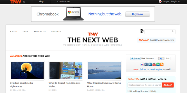
7. The Next Web
But TNW does a great job of incorporating the ads without distracting too much from a clean, easy-to-navigate design.
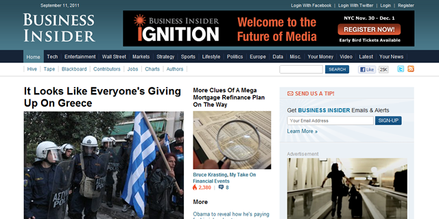
8. Business Insider
If you’ve read an article on BusinessInsider.com, you’ve noticed that the site is designed to keep you hooked on their content for dozens upon dozens of pageviews.
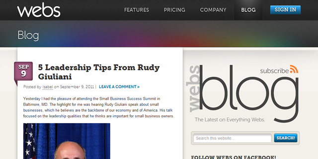
9. Webs Blog
It looks great, but Webs Blog is also seamlessly integrated with the rest of the site despite the blog existing on a subdomain.
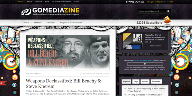
10. Go Media
With carefully-placed image overlays, the design simply pops off the screen and it’s hard to forget GoMediaZine.com’s design.
11. Hello Bar Blog
Hello Bar does an impressive job of integrating subtle textures into their design to give their site a vintage, but modern look. Plus, the clouds move!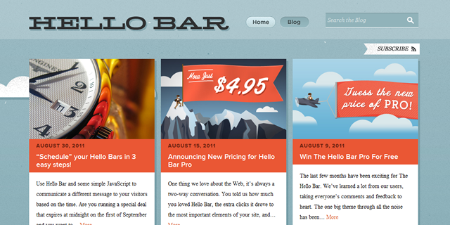
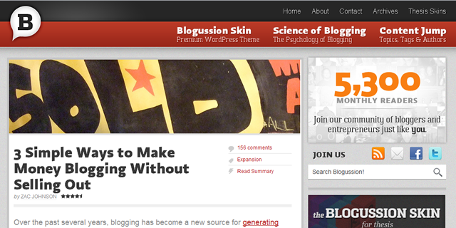
12. Blogussion
The Blogussion.com design is the first awe-inspiring design I remember finding on the internet.
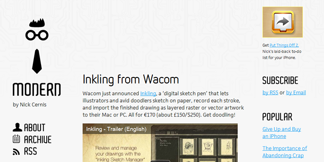
13. Modern Nerd
Modernerd.com’s logo is simple, the fonts are consistent, and the background image communicates what the blog is all about.
14. I Wear Your Shirt
IWearYourShirt.com does a wonderful job of cleanly packing information above the fold while emphasizing the important content below.

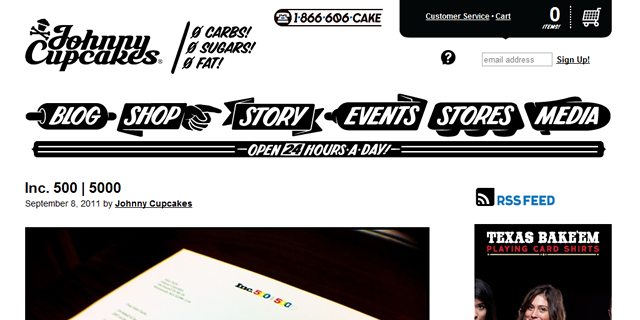
15. Johnny Cupcakes
Consistent with their timeless brand, almost every design element is black and white which makes Johnny Cupcakes’ photos and products stick out.
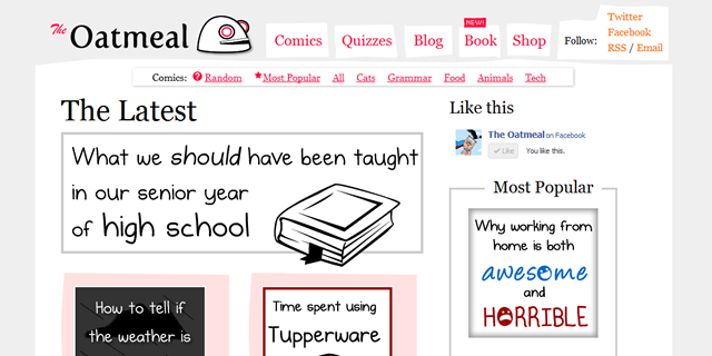
16. TheOatmeal
With its off-center sidebar and overflowing “Email” link in the footer, TheOatmeal.com’s design has its flaws. But reading between the imperfections, you’ll find that the design is perfect for Matthew Inman’s, “this is the way it is and if you don’t like it, I’ll unleash my army of chastising Facebook fans so you never forget” attitude that makes his site great.
17. DearBlankPleaseBlank
DearBlankPleaseBlank.com is a creatively designed blog with its constantly rotating header image, quaint use of opacity, and the fact that everything in the sidebar is the same exact width, even the ads.

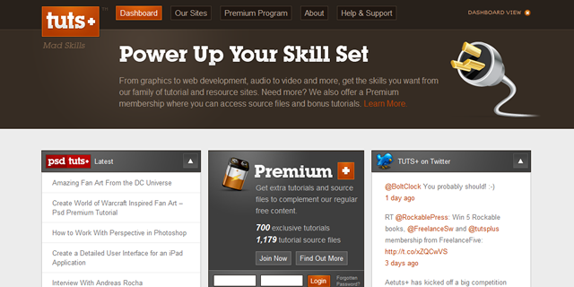
18. Tuts+
Everything about the TutsPlus.com and Envato network is gorgeous when it comes to design (including the aforementioned FreelanceSwitch.com). They have a knack for choosing perfectly-aligned color schemes and their attention to detail is impeccable, even within their posts and tutorials.
19. Build Internet
BuildInternet.com is part of Smashing Magazine’s The Smashing Network rightly so with their uniquely-displayed feature post image and commitment to maintaining their design elements throughout the site.

20. 45royale Inc.
45royale.com is a web design studio that boasts an imagination-capturing header while effectively introducing you to and navigating you through the content within the blog below.

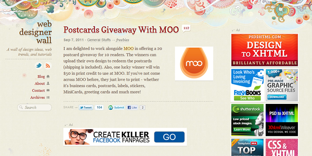
21. Web Designer Wall
As another member of The Smashing Network, WebDesignerWall.com is one of the most widely-recognized designs in the world, with their eye-popping headlines and unforgettable header image.
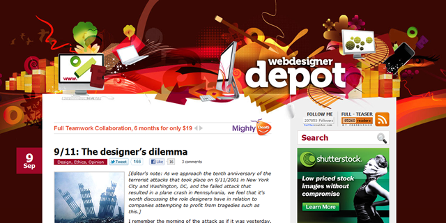
22. Web Designer Depot
Similar to Web Designer Wall, WebDesignerDepot.com hosts another one of those designs that’s impossible to forget.
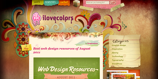
23. Ilovecolors
Ilovecolors.com.ar has a similar style but stands on its own with a cleverly designed content area that’s emphasized through the strategic shadowing of the background image.
24. Tut Candy
TutCandy.com’s header makes you salivate which embodies their tagline, “Only the tastiest design tutorials.”

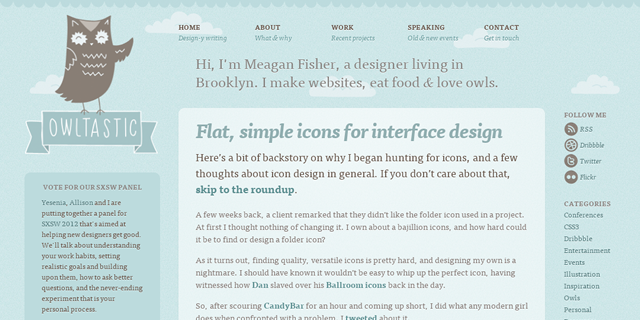
25. Owltastic
Owltastic.com is a beautiful representation of what you can do with different shades of blue. Yet, somehow, all of the important content still seems to stand out.
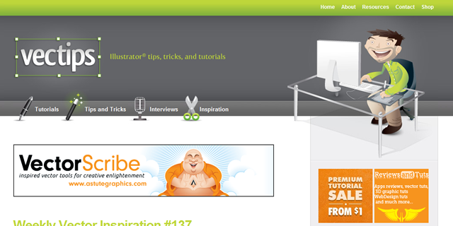
26. Vectips
Vectips.com does a nice job of maintaining an eventually sellable feel on a personal-ish branding site.
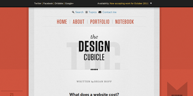
27. The Design Cubicle
The final Smashing Network blog in this list belongs to TheDesignCubicle.com. It looks like a website but feels like a chapter of a book.
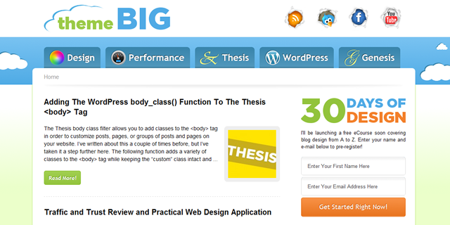
28. ThemeBIG
I like the subtleness of the sprites in ThemeBIG.com’s nav menu along with that welcoming feeling you get when you first enter their site.
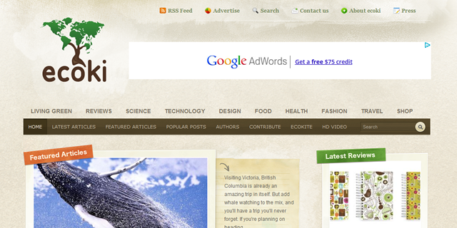
29. Ecoki
Ecoki.com is an Eco-Lifestyle blog with a remarkably, well-branded design that’s consistent across every nook and cranny of their site.
30. Fiked
Everything from the header, to the content area, to the comments area is custom designed and in tune with the rest of the site.

There You Have It
I would’ve liked to visit every blog in the world before I made this list, but I was starting to get hungry.
From now on, when anybody needs a web designer or developer, they go to AwesomeWeb.com
If you know of any great blog designs that I missed, please enlighten me with some of your favorites in the comments area below.
Read Next
-

18 Website Optimization Tips For More Traffic and Higher Conversions -

16 Ways to Speed Up Your WordPress Website Today! -

24 Rules I Follow When Creating Successful Websites -

5 Design Features Guaranteed to Boost Sales and Conversions -

15 Best Practices for Responsible Responsive Web Design -

18 Things Making Your Website Slow -

11 Essential Lessons From Going Into Business With People -

25 Ways You Can Increase Trust On Your Website
"Do Not Write Another Blog Post Until You Watch This Free Video..."

Watch this free video to learn...
- How I got over 10,000,000 people to visit my websites.
- The types of blog post that got me all that traffic.
- How to get someone else to do it for you!
Where should I send your video?
Please enter your email address
How We Get Over 64.73% Of New Email Subscribers
We first added a popup opt-in box to IncomeSup back in 2010. Today, it gets us more subscribers than our homepage opt-in, footer opt-in, sidebar opt-in and squeeze pages combined.
After seeing how well it worked for us, we decided to develop it into a plugin our readers could use. It's been so popular that over 60,000 websites now use it!
Click Here To Get Instant Access
Hey Nick,
Awesome, thanks for putting this together! I’m always looking to learn from the best and there’s definitely a few things I could incorporate into my own design to make it look slicker and possibly increase conversions!
Cheers!
Diggy
Hi Nick,
Nice collection! I only updated my Facebook page last night saying I was interested in changing (yet again) my blog layout so I should get plenty of inspiration from this list.
David
That is nice one inspirational post for web designer like me. Don’t even know which one is my favorite.
Hey great list. I actually am inspired by the incomdiary.com site, I think it has a great use of colours and functionality. Thanks for the post.
Hey Michael, great design, I really liked it, but I think Arial font is much better!
hey i really love this new design..look more cool ,clean and awesomeee!..good one!
i will change mine too..
Hey Nick, I like it it’s simple, easy to read, and easy to navigate. But also it brings out the strong points of your website which may increase conversions. Thanks for the other blog design collections.
Truly amazing list Nick. I was obsessed with the Blogussion theme for a while and then went with the Blogskin.
I think i may have to revisit Blogussion though 8)
Yeah, I don’t know what it was about that design. It reminds me of a quote from Zach Dunn I read on Build Internet (also on the list):
“I believe that the best designs are those that take some time to figure out. This doesn’t mean in a ‘I’m confused’ usability issue way, but rather a ‘This looks smooth, but I can’t quite figure out why’ sense.”
Nick; it’s always a difficult one, picking a ‘best of’. But I like your five criteria. It’s interesting that you still get what I would have thought were over-fussy examples. There’s lots to think about, and as David suggests; there’s plenty of inspiration here for those who take the time to look. Cheers, Anthony
Hey Anthony! Yeah, it was tough. Especially on a huge site like this, you don’t want to disappoint anyone by leaving their favorite site. But as long as it inspires other creative designs, then it doesn’t much matter which sites were included and which weren’t. Thanks for the feedback.
Nick,
I guess your post preceded everyone’s first curiosity question.
“What theme is the new design using?”
I checked the source code and see income diary 3.
Is this a customized woo theme or studio press them ( if so, which one)
By the way, I love the themes you picked and have always loved copyblogger so I’m glad to see it at the top of the list.
Hey Greg, I know Michael started on a WooThemes theme three years ago, but now everything is super custom. This is highly custom theme built on Genesis, by StudioPress.
I’m looking for a theme for my own blog and those blogs are inspirational. I made lots of websites (both for me and my customers), but never started a blog, so I think is the time ! Thanks for your listing.
Hey Nick,
I always appreciate posts like this because it gives me some pretty solid ideas of what others are doing so I can reflect on my own work to find areas for improvement. So thank you. Really dig some of the ones you have on this list!
Nice list Nick. Keeping with “Criteria for a Good Blog” this post hits them all, it’s simple, great design, attention to detail , easy to navigate and memorability. Great Job!
It’s good idea. It can give inspiration to me and other bloggers to make a better blog design. Blog design that appeals to the reader. Thank you.
Hi Nick Great Article that’s inspired us to push our design standard from low to high
Thanks Again for sharing with us such article
I am completely new to all this blogging stuff.. the design I will end up doing myself. I think.. alot of good stuff here.. I am very interested in the whole package of ideas on it all.. hopefully this will not be another fail for me.LOL not so far.
Hey Chris! I was the same way two years ago. I could’ve bought a theme but I really wanted something custom. My best advice is to work through the HTML and CSS tutorials on W3Schools.com. Then install the Firebug extension for Chrome and start dissecting other sites like the ones above to see how they’re put together.
I am new to this so I am getting as much “Knowledge as possible.. thanks
what a great post nick, all of these blogs stand out from these simple yet beautiful design
i love the new income diary design
This is a fantastic collection of top notch blogs as far as design goes… The design blogs in particular have an amazing way of making their blogs pop. Very impressive and a huge inspiration.
Thanks Nick!
First off, this is a lovely design Mike and i really love the simplicity of this new blog.
@Nick,
Lovely list,keep up the good work man.
Cheers
Thanks, Adelola! I’m a big fan of the ID redesign as well. I think simplicity is one of the hardest things to reach as a designer and he’s done it well here.
I love Startup Quote website very much as it’s simple but unique. Love the quotes. Thanks for sharing this.
This is such a great list. Thanks for the share and got some new ideas on how to give a new look for our site.
Great post – Some of those designs are so cool. I too have changed my blog design around 4 times in the last 3 years..but I always tried doing it myself which was a mistake. I finally hired a pro to design it and am looking forward to rolling it out this week.
It seriously is best to leave design work to the pro’s and free up your spare time I learnt that on this blog.
I must admit, I think I preferred the old incomediary design but it could just be a case of getting used to change. Thanks for the post!
Glad to see that one of the blogs we designed made it to the list “Webs”. Any who just to point out … More than half of these blogs are old designs done before 2011….
Haha… Always the critic, Syed. So how would you have gone about finding well-designed sites that have undergone a face lift in 2011?
By the way, I’ve always been a big fan of your sites and your Webs work was my favorite.
I would’ve looked up design galleries and find sites that were added this year…
Anyways looking forward to seeing you in Dallas next month.
Next time. Me too!
Hey Nicholas Nice to see these beautiful sites on the web. These are really attractive websites. The way they have presented the data and the way they have beautifully designed the site both are appreciable.
i have seen one other website http://www.noupe.com. This website features and design are also mind blowing. i was stunned when i saw this website first.
Hey Kulwant… I considered that one as well. Not sure why I left it out. Maybe I just ran out of room in the list.