12 Conversion Boo-Boos That Make Your Website Stink
In my previous blog post, I covered 7 fast and easy strategies to help increase your conversion rate. This time I’d like to take the opposite approach.
I’ll talk about the conversion boo-boos (yes, it’s the technical term for that) we marketers often commit. In doing so, I hope to make you become aware of the many ingenious ways we internet marketers make our prospects bounce, get turned off, not buy and cast us into complete oblivion.
But first…
Let’s Play a Game!
For any conversion boo-boo I mention here, think of a specific web page you’ve encountered that has committed the same. Then post the link or submit a screenshot in the comment section. If it’s a great example of the conversion boo-boo, we’ll use that page as a glorious illustration here in this blog post, with credits to you!
For this reason, I have deliberately included only a few images here.
Sound fun?
Let’s begin…
There are numerous factors that influence your conversion rate. However, generally speaking, when our website fail to convert your prospect (Joe is the name I’ll use to refer to “your prospect”, and for our purposes I’ll refer to Joe as a man or a woman or both), it’s because one or several of the following is/are happening:
A. Joe’s Specific Needs, Motivations and Desires are Not Met
Many sales are lost primarily because we failed to meet our prospects’ needs. We do this in various ways:
1. Not having solid market intelligence (or worse, having it but not using it).
I know I already harped on and on about this on my previous post, but it’s only because it’s the single most powerful thing you could ever have/do as a marketer. If you really want to covert, aim to develop the skill that Mel Gibson had in the movie “What Women Want”.
The lesson is clear: You may be the best looking salesperson in the world who know all sorts of fancy selling techniques, but if you don’t have a friggin’ clue who Joe is, what conversations she’s having inside her head, what she’s afraid of, what her biggest frustrations are, what his ultimate fantasies are, etc then you’d have trouble converting your visitors into customers.
2. Trying to sell to anyone.
A saying goes, “chase two rabbits and you catch none” (I’m pretty sure it was the legendary Anon who said it. Or some really old Chinese wise guy.)
For example, instead of targeting “anyone who wants to get their dream body and look good”, get clearer about WHO your niche market is and write a copy specifically for that persona. It could be:
- the skinny guy who’s got only 15 weeks to put weight on, and look big, strong and muscular on his wedding day.
- the obese 18 yr old girl who wants to stop feeling like she’s invisible, and gain self-confidence.
- the woman who just gave birth and wants to lose the fat and get her sexy, toned body back.
- the rich, successful but time-poor 53 year old business exec who wants to look leaner, get more energy, and be able to play with his grand kids without feeling like he’s going to have a heart attack.
This doesn’t mean you shouldn’t serve multiple market segments. It just means that if you want to convert more people, you need to present your offer in a way that makes certain people think, “They are speaking directly to ME! This company is solving MY problems. They made that solution especially for ME!”
3. Not appealing to both emotions and logic
Pretend you’re a 25 year old single man who is having trouble getting a pretty, fun girlfriend because you don’t know how to approach women. Which of these opening lines would grab your interest more:
# 1: “How to approach women with confidence”
versus
# 2: “A simple, works-every-time way to approach a woman in a way that makes her see you as an attractive, sexy man she must get to know but actually gets her turned on as she is talking to you (you can learn it in 30 seconds, and it works especially well on those smoking hot, snotty women who usually don’t give men their time of day)”
’nuff said.
(By the way I stole these from Craig Clemens)
4. Not being customer-centric
What’s worse than not being customer-centric? Believing that you are customer-centric when in reality, you’re not.
Not being customer-focused can take many forms, some of which are subtle.
a. You do it when you don’t implement changes based on the user feedback you get.
For example, if you keep getting asked what your returns policy is, slap on a ‘Returns Policy’ link somewhere more prominent/obvious. If you’re driving decent traffic to your free giveaways but not getting enough opt-ins, maybe the freebies are not very valuable to Joe in the first place. Get Joe’s feedback, get some clues from your competitors, then change it.
b. You’re not customer-focused when you craft your website based on how YOU think, your preferences, and your opinion, without asking for feedback from the very people you hope to serve.
(Like when you make your website mostly pink just because it’s your favourite colour; or when you insist on organising your site’s information a certain way in spite of the fact that you get many questions from visitors showing their confusion/difficulty finding information.)
c. You’re not customer-focused when you make self-aggrandizing claims that are left unsubstantiated, or when you say “we” in your copy more than “you” :
“We are the best, fastest, easiest and best-value.
We have been in business since 1808.
We are pioneers in our industry.
Our standard is superior, our service is world-class.
We have offices worldwide.
We are so good at what we do, that we published many articles and won lots and lots of awards…”
I heard someone call this as “we-we’ing”. In short, stop pissing all over your website, then wonder why it stinks
Use “you” and “your” more in your copy, and you’ll be trained to think and speak in terms of how Joe is going to have a better, happier, richer life because of your offer, instead of you talking in terms of what a God’s gift to humanity you are.
B. Joe Doesn’t Truly Understand the Benefits/Results He’ll Enjoy
Have you ever been to a web page, scanned through the entire page, and you still haven’t a clue as to what exactly the site can do for you?
Yep, we’ve all been there. Classic examples are…
5. Hiding the benefits your product/service provides.
This is often the case when you’re selling something that’s perceived as complex, new or technical, and you’re trying to sell to people who are unfamiliar with your fancy words. Your statements may make complete sense to you because you’re an expert at what you do, but be aware how they may sound like gobbledygook to another.
Take the case of “hidden benefits”, or benefits that you know your product/service provides, but your prospects may not necessarily know about. For example I saw this “stool” in a shop in Camden last weekend. Had it not been for the explanation, I wouldn’t have known it wasn’t just a weird looking thing to plant my booty on.
I also found this musical instrument called didge or didgeridoo with a very exciting “hidden benefit” :
Naturally, I bought the whole lot.
But only cos Christmas is coming soon.
C. It’s Unclear to Joe as to WHY he Should Buy YOUR Offers NOW
Noticed the caps? You could avoid this mistake by avoiding the following:
6. Unclear “Value Proposition”
I’ve explained UVP (unique value proposition) in my previous post already so please refer to it again. In todays’ marketplace where your Joe is inundated with marketing messages, it’s very important to emphasize why you are uniquely positioned to meet his particular needs, and what you’re able to provide that other vendors don’t (or don’t provide as well as you do).
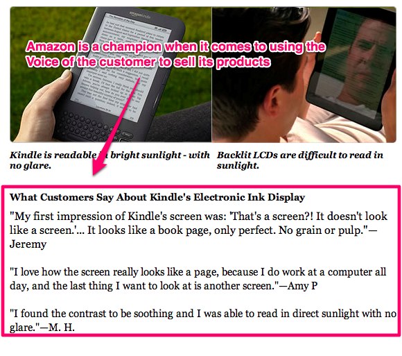
7. Not utilizing the Voice of Customer (VoC)
Telling Joe that your stuff is good does not have the same impact as hearing Jill, one of your customers, say that you’re awesome and that your stuff is like Manna from heaven. So why not let your customers sell your stuff for you?
Notice how all three statements talked about the same feature/benefit – could it be because the electronic ink display is the Kindle’s main UVP? (wink)
D. Joe Doesn’t Know What She Should do Next to Get What She Wants, and How
Here is where usability issues could come into play. Since usability is a broad topic, let me just hone in on one of the most common usability issues :
8. Lack of Active Guidance from You
A classic example of this is having no clear Calls to Action, or having no clear guidance on ways for Joe to “move forward”. In the words of MarketingExperiments.com :
If you don’t guide visitors to your main objective, someone else will. Use the five elements of guiding eyepath (size, shape, color, position, and motion) to clearly communicate with your visitors (1) where they are, (2) what they can do on your page, and (3) why they should do it. In seeking to answers these questions, you may find that the less (distractions) you put on your page, the higher your conversion rate will be.
Remember that just because the next step may be clear to YOU, doesn’t mean it’s clear to Joe (even if you think you’re vey much like Joe). Don’t expect them to unravel the mystery behind your cryptic copy and secret offer.
Saying that though, what most internet marketers are guilty of is having too much call to action, to the extent of being douchy and annoying (e.g., having the buy now” button inserted every 5 sentences, or having big red animated arrows pointing to the call to action buttons).
Remember that people buy not because you told them to click a button. People buy because they think you are best positioned in the marketplace to give them what they want.
9. Confusing – could be the copy, the layout, the design, the way the information is presented/organized.
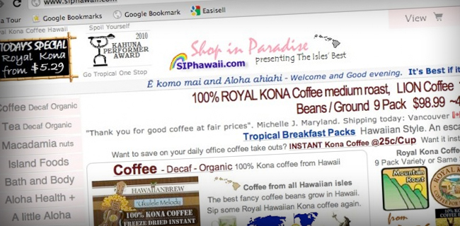
For example, I found this e-commerce website in webpagesthatsuck.com :
This website is trying to cram too much information everywhere, that it’s difficult to decide what you should do first or what to click. Everything jumps out at you, competing for your attention, and there is no clear thought sequence to follow.
If you want to convert, think of ways how you can make your visitors’ experience easy, pleasurable and hassle-free.
E. Joe has Questions, Fears, Uncertainties and Doubts that You Hadn’t Fully Dealt With
At the heart of every failed sale are prospects’ questions, fears, uncertainties and doubts (FUDs) that were left unaddressed. A few examples are:
10. Important information is difficult to find, or buried somewhere inconspicuous.
Hands up if you’ve been to a website and the pricing is impossible to find in one or two clicks. Or how about a restaurant website with no link to their address, no map to their location, and their phone number is nowhere to be found?
Or the menu requires you to opt-in before you can view it or they require you to download it?
Frustrating, isn’t it?
11. There simply isn’t enough information.
Have you ever been to an e-commerce site before that’s selling a product you’re interested in, only to get frustrated because there is no (or very little) product description?
Have you ever been presented with the buy button, when you don’t even know yet what the product could really do for you?
One thing I noticed is that many marketers are afraid to create “long” sales copy. If you’re asking someone to make a buying decision, give them all the information they need to make a well-informed decision!
12. Short-term thinking.
I once helped create a sales page that converted at slightly above 5% when it was first launched, but we soon realized that the customers we’re getting didn’t actually understand what was included in the packages they bought, resulting to a lot of support emails from frustrated customers with false expectations (the offer was quite technical and expensive).
We revised the page, which resulted to a much longer copy as more information needed to be presented and clarified to avoid misunderstandings. After the first revision it converted lower than 5%, but the customers we acquired were our ideal customers, there were very little complaints, and certainly no refund threats nor were there any unreasonable demands. Conversion was lower, but our net profit was higher because overheads, refund rate and stress were considerably lower, too.
I also know someone who had a similar experience during a super hyped-up launch. They had a high-converting page, but they also got a high refund rate and high levels of complaints from buyers. In the end, the marketer decided to stop using some of the selling tactics he used during the launch because his brand and reputation was more important to him.
Are you making the same mistake? Ask yourself what’s truly important to you over the long term.
Conclusion
Making your customers the center of your marketing universe is one of the pillars of conversion rate optimization. It’s a mindset, a philosophy, and a practice that you must do daily if you truly want to be a great marketer.
Evaluate your marketing materials and ask yourself this question: “In what ways am I committing <insert conversion boo boo here>?” Then look at your website pages one by one and identify how you’re hurting your site’s conversion. Develop your testing hypothesis, then test and measure the changes you made.
Happy testing, and don’t forget to report back here with links to conversion boo-boo’s you see around the web!
About the Author
Marj Galangco is a certified Conversion Rate Optimization and Web Analytics Practitioner. She’s also the co-director of Easisell, a company offering premium web design and web development services to successful internet marketers.
"Do Not Write Another Blog Post Until You Watch This Free Video..."
Watch this free video to learn...
- How I got over 10,000,000 people to visit my websites.
- The types of blog post that got me all that traffic.
- How to get someone else to do it for you!








Great Article Marj! WOW that site that you used sure is busy!! Lol that’s the most common problem I see is TOO much going on.
And it shows when a website is merely going after a sale when there are a million and one ads everywhere.
One thing that gets to me is when a site has adsense activated on 5 different places on their website. Seems a bit desperate to me.
So true, it reeks of desperation.
Not only that, AdSense isn’t effective when it’s obvious, that’s why the highest conversion are seen with the text ads.
Seamless integration seems to be key when it comes to AdSense, at least in my opinion.
Some excellent pointers here Marj. I like the one about we-weeing over your site Very true. Would be cool if some of the regular Clickbank marketers applied points 11 & 12 in their copy. Sometimes you can read the entire sales page and still have only the vaguest idea of what you’re being asked to invest in.
You read all the way til points 11 & 12? (feigns surprise) WOW I’m impressed!
Kiddin aside, I hear you, Nic.
Long-term thinking is definitely the way to go, if you want to stay in biz for a long time.
I’d rather keep a great reputation with fewer customers, than have many buyers who turn into angry, frustrated ex-customers, cos you can bet your life that they will spread the word about how lousy their experience was!
How do I find out who to target, for example I have a blog on teaching women who want to become skinny the healthy way, I feel it is still pretty broad but how do I target the 18 year old obese girl who feels invisible, or the mother who put on weight and now wants to lose it?
Great question, Luis!
You can try creating a series of blog posts or videos or whatever type of content targeted to one specific persona.
for example create a 3-part series for obese female teens, then recommend solutions and actions tailored to them.
On another period you can publish a series of videos for new mothers.
Tip: create stories around your content. For example let’s say it’s June, and June is a popular month for getting married. Create content targeted specifically for those who want to look great in time for a wedding (maybe they are the bridesmaid, or the bride, or the bride’s sister – think Pippa Middleton!)
It’s OK to have a broad topic like yours, you just need to create content with a specific person in mind so you have a targeted message.
Did that help?
Thank you Marj, that helps me out alot I am going to create that.
So so true Marj!
Yet I see these mistakes everywhere and I even make them myself on occasion!
As Nic says above I wish some people would read points 11 and 12! So many people are just way too vague in their copy!
Keep up the great work!
Simon
Hey Simon,
Yes we are all guilty of these mistakes. I should know, I used to be a Pro at ’em
The important thing is to be aware, and to learn from our mistakes.
It takes practice, and willingness to come from an authentic place of serving others – beyond the money making
what me make any or those mistakes ….never …lol….thanks for the article ….feel free to visit the site and tell me how many of these pointers I make that you see ….sometimes a person gets blind to their own mistakes ….thanks
I love the info and I also love all the feedback. As a newbie I like to see how everyone thinks and the ideas are fantastic.
What a solid post Marj, im really speechless, thanks a lot. You covered pretty much everything well.
Appealing to emotions and logic is so key but many people overlook it. A woman’s decision is typically by emotion and men usually make decisions by logic. The key is having a deep understanding of your demographics in your market and the desires (appealing to emotions and/or logic) of your ideal customer or client.
Well what can I say, the more value direct information to the point content you give with the Q&As is so much more going to convert, than a rushed old buy this thing but what is it.com
I always love your blogs the content is super rich it feeds my mind.
Ian Bruce Horner
Respect And Share Ideas
Hahhaha! I love that domain – BuyThisThingButWhatIsIt.com !
Classic!
Hey Marj,
It’s great to see you back here. I found your previous article so engaging, and this one is no different. Great tips, and I love your little interactivity game… very clever…
In fact I will play the game with you… and post one of my own websites that I know is guilty of Sin #1 or A.2 (Trying to sell to anyone.). The site is a flower / florist website and pretty new (I am not a florist btw), and I recently realized that trying to cater for florists and consumers or “Joe” to use your words just isn’t going to work the way I have the site structured. Here is the link:
http://www.floristchronicles.com
I am sure you will immediately see the problem, but notice the second and third most recent posts aimed at florists specifically… Needless to say, while the e-Commerce infographic was featured on the home page, Joe was pretty confused when he / she arrived at the home page.
I think I will have to separate the two targets much more distinctly to avoid this confusion, or just pick at target market to go after.
Feel free to use this site as an example… or not…
PS: I can handle criticism and am laughing at myself as I type this…
B
Brendon! Nice to see you back!
Right, I think this could be a great feature for a website review kinda-blog post.
If you are game, I can review your website and post my recommendations on my next blog post here in IncomeDiary. Don’t know when that will be yet as I am inundated at the moment, but maybe in 4 weeks time?
I won’t be gentle, but i will be honest and kind.
What say you?
Ok, game on Marj!
Alriiiight!
I got your LinkedIn message by the way. Will get back to you soon so we can work something out. Don’t worry, it’ll be a collaborative process
Thanks Marj, I look forward to that.
The information is tool good I will try and get back with the result as people will only believe after seeing the results. Hoping many will join the by following the tips mentioned.
This post is a real gem for all bloggers who have tried and failed at conversion of traffic into actual sales.
Although some of the tips you listed and explained here are common principles of marketing, but when applied to the online environment can deliver results that are better than it would be without such concerted efforts.
Thanks for the valuable post.
Exactly, Deepak. I’m aware how some people think CRO (Conversion Rate Optimization) is all about changing colors or layouts or random things on one’s website, and seeing what converts better.
It’s NOT.
I’m on a crusade against this misconception
Great article Marj, everyone one needs to know about conversions, well at least the basics.
Utilizing the VOC has been my deadly conversion secret for years. Well it’s no secret, but is the most important factor of all. (in my opinion)
That site sure does look shitty LOL. You’re right about there not ever being ENOUGH information, totally true. Learned some valuable stuff!
Call me weird but I welled up with joy when you said VOC has been your deadly conversion secret for years
Great article Marj… Love the information and I loved the way you write… Hope to read more interesting blogs from you…
Thank YOU, Nicole! The pleasure is all mine
Love the article marj, i love the descriptive thoughts, thanks anyway
These are some great ideas. I was guilty of plastering adsense image ads all over my blog, until someone pointed out to me how distracting it was and how it cluttered up my blog. My blog has great content, but the conversion rate stinks, even though the site is getting over 45k visitors per month. My affiliate income was very low even though it was making a few hundred dollars a month from adsense. I have since removed the adsense ads, so I’m waiting to see if my conversion improves.
I’m also going to heed your advice about targeting specific groups of people with my posts instead of trying to target everyone instead.
Hi Zandra,
I hear you loud and clear.
Adsense could be a great source of income, however :
1. If you’re exerting a lot of effort (and spending money) driving traffic to your site…but when they get there you actually want them to click away from your site (by clicking an adsense ad), then you GOTTA be making enough revenues from each click to make it all worthwhile.
In other words, your earnings per click should be big enough.
2. If it’s not, then you might want to ditch the Adsense and focus more on LISTBUILDING, and then get your list to buy stuff from your recommendations via your email and blog posts.
3. Or you can also put up banner ads promoting affiliate products* OR your own products, like Michael is doing here in IncomeDiary
*again, you must choose these affiliate products carefully. Choose those that give you enough commissions and those with sales pages that are high converting, to make it worthwhile.
All the best!
Hey Marj,
I love what you point out in number #2, actually I love the whole post but I thought of a very important lesson when I saw this one.
Knowing who your perfect prospect not only helps you convert better. It also can save you TON of money in your marketing efforts because you find out who you SHOULDN’T be advertising too.
One business I heard about was able to knock the whole state of California off of their mailing list. That put a gigantic chunk of change back in their pocket that they could use towards the states where people where actually buying from them.
Thank you this entertaining lesson on oh-so important principles.
Yes Nerd #2!
(You love #2, dontcha?)
Point number 2 is definitely a BIGGIE. For many startups (and I plead guilty), niche marketing is a weird concept. Some even shun it.
But you’re right, if you know EXACTLY WHO your Joe is, you’d be able to focus on his specific needs and you’d be able to serve her at the highest level possible. By doing this, you carve a reputation, a brand that makes you stand out in the marketplace.
Example:
Someone who is marketing himself as a “personal trainer”
VS
someone who is positioning himself as “THE Body Transformation Trainer – the top secret personal trainer of hollywood actors who need drastic physical transformation for an upcoming role”
Yes the 2nd guy might get just a few clients a day, but if each client is paying him $300 to $1000 per hour (not to mention all the brand building, consultations, product creation opportunities & endorsement deals he could win!), it could be a pretty lucrative practice.
Hey guys,
I just want to say after this great post (and Marj’s other post), I decided to contact her company for a possible blog redesign and put some idea’s accross that I had.
Marj is truly amazing – I’ve been in contact with a few designers and put my idea’s to them but most just reply with a simple “Yes, this will cost you $xx”
Marj actually told me that they were fully booked at the moment but STILL proceeded to reply to every point I made in the email AND gave me idea’s about how to increase my conversions!
I found that so refreshing – You can tell that she actually loves what she does and isn’t just in it for the money like the other designers I contacted are. None of them were interested in my idea’s..only in giving me a monetary figure.
Just want to say a big thank you, Marj! And thank you Michael for exposing her to us. Keep up the great work guys.
Aaaww thanks a bunch, Altug! It was my pleasure to serve you, and your testimonial here is a huge bonus
Let’s keep in touch, you’re welcome to bounce your ideas off me anytime!
Great job Marj, really enjoyed this post. Conversions are key to a winning site. Thanks again Marj.
Good advice for marketing any products! Some things just don’t sell themselves and you need to know what people want, or make them want what you’ve got!
CRO (Conversion Rate Optimization) saved our campaign on Adwords. Conversion tracking involves placing a cookie on a user’s computer when he/she clicks on an ad. Then, if the user clicks on your ad and reaches one of your conversion pages, the user’s browser sends the cookie to a Google server, and a small conversion tracking image is displayed on your site. When such a match is made, Google records a successful conversion for you. Over a period of 6 weeks, Simon’s team at RDM lowered my CPA (cost-per-lead) by 27.6% simply through creative split-testing of new ad copy. It’s often overlooked but is still a very important part of the overall success of your PPC marketing with Adwords. Simon’s team will do an audit of your account for free, you can call him at 888-648-5526.