Why Most Websites Fail
A couple weeks ago, we here at Income Diary decided it would be a good idea to see what our readers websites were like, and offer them free critiquing at the same time. This has given us a really good advantage when it comes to give our readers advice, because now we’re fully aware of what their websites are like, and more importantly, where they’re going wrong.
Terrible Quality Content
It’s awfully tempting to want to start making money online, and one of the best ways to do this, is to start teaching others how to make money online. This sort of thing occurs across most niches, where people want to start making money, through teaching their own tutorials on the internet. I do the same with my photography website. I spend hours every week coming up with fresh and interesting content that will interest my readers, while I try to fit in working around other websites at the same time. With blogging being so easy these days, everyone wants to do it, but not everyone wants to put in the time and effort it takes. I brainstorm, and take notes throughout the day about topic ideas, and posts that I could research, so that I know that the content that I write will always be better than my competitors. I do this for a few reasons. Firstly, if something is worth doing, then it’s worth doing right. Secondly, the more you write, the more likely you are to be found by others. Finally, and most importantly, if you’re writing the best content on the internet, then pretty soon your competitors are no longer your competitors.
Fresh ideas, along with good quality, and well punctuated writing, is the key to creating quality content. If you’re just taking ideas from other people in your niche, then it’s fairly likely that the more established, better quality content, is going to be ranked higher in Google. Another problem that Income Diary has is people blatantly ripping off our content, sometimes simply copying and pasting, and other times using our articles as a direct blueprint for their own content. Imitators will never have the same results as someone who goes out of their way to create original content, so if you don’t think you have what it takes to create original content, then you might as well give up.
Infrequent Content
You can write the best content in the world, but if you only ever post it once a month on your blog, your website will struggle to do well. If you want your website to grow, you need to rely on a consistant following, that will feed your website with pageviews, and to do that, you need to post content multiple times in a week. I will update my website a minimum of 3 times a week, and for Income Diary, it’s more like 5 times a week, with subscribers receiving the information very frequently. Followers of our websites are constantly reminded of our presence, and so are sites like Google. The more content we post, the more likely we are to appear in Google, which will lead to even more traffic. The thing about writing content is that you never know which content is going to be the most popular, so if you just keep posting content, then it should eventually be picked up by someone of interest, who will share it with many more people. I have written over 110 posts on my own website and around 40 on here, and that’s all in the past 8 months. Commitment like this is what separates you from the competition.
Poor Social Following
I’m surprised at how common of a mistake this is, but I guess it’s because I started my website in the apex of social media. People who don’t understand social media, are missing out on a huge potential following, which will help to keep their website alive. It’s not enough to simply open a Facebook and Twitter account, you actually have to put in some hard work make people want to follow them. This is where we lose most people, it’s at the idea of hard work, because when there’s hard work to be done, there’s always something better to do. As I browsed through the websites submitted to us last week, I noticed that a lot of the poorer websites had very small followings, which likely consisted of friends and family.
Roughly 3% of my Facebook following is from friends of mine, and I would be surprised if I even knew 0.5% of my Twitter following, and that’s because I use my social media properly to grow my following. This includes inviting my readers to like my page, and using my Twitter account to find people in my niche, where I post content from my website, which ultimately leads them to my fan page. Up until just recently, my aim when finding new followers was to send people to my fan page, and not my website, because if I could get someone to like my fan page, then I knew that I could get them to come to my website on multiple occasions in the future. When you start to embrace the power that social media can provide for you, then you’ll start to see some serious results. Turn one visit, into many.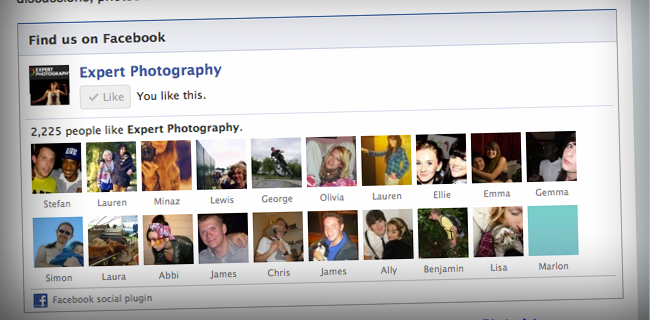
*Note: I only stopped sending people to my fan page through a Twitter DM, because I’m trying to promote content that I want to go viral.
Minimal Interaction
It would be a shame to miss this simple, but vital step out of your website’s promotion, because it can make a real difference. If you have a fan page, but don’t really use it much, then Facebook starts to recognise this and acts accordingly. What this means is that they will see that people have stopped interacting with you, and stop sharing your content with parts of your following, even if they do like you. Think about it, how many pages do you like on Facebook, but how many do you actually hear from? It’s a two way street, if the reader isn’t clicking on your content, replying to comments and polls, then Facebook will stop showing that reader your content. Daily updates, or at least five updates a week are essential on Facebook, and they’re easy to do because you can ask questions and polls, and post photos, in between articles.
When you’re on your own website, then it’s important to reply to peoples questions when they ask you, because not only will they consider you to be more of an authority, but they’ll be more likely to come back. This is all public too so other people are going to see it, and respect you and your website more. The same goes for Twitter, I keep TweetDeck open at all times, and whenever I get a Tweet, I stop what I’m doing and answer it straight away. This does not go unnoticed.
Human interaction turns your website into a persona, and the steps to getting there are remarkably simple. People don’t want to talk to a website, or a program, they want to talk to a person. If you’ve ever updated your Facebook through a program like HootSuite, then you’ll know that it doesn’t provide you with very good results, because it leaves a tag, sharing where it came from, and people immediately know that it’s not a person behind the update, it’s a computer. This is a good indication that if you want to be taken seriously, you have to interact with your readers.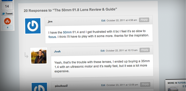
Design Sucks
First impressions are everything, and because everyone judges you by your appearance, you need to make sure that you’re looking sharp. When I went through some of the sites that were submitted to be critiqued, I was horrified by some of them, because it seemed as if some of them hadn’t even bothered thinking about their design. Something that always bugged me was the fact that we didn’t have a logo up on ExpertPhotography, it was just some writing, in a horrible font, and bad colours. Recently, we’ve had a logo designed and put into the header, which you can see below, and it’s actually changed the way I feel about the website. It makes the website look much more sleek and welcoming to any new visitors. Even the popup that I use from PopUp Domination is in keeping with my logo and website design.
One common factor with people who had attempted to try and design their website, but failed, was the fact that they were trying to do too much at once. When it comes to website design, I personally believe that less is more, and I’ll tell you why… I come from a background of photography, and one of the most important lessons to learn when taking a photo, is that whatever isn’t adding to a photo, is taking away from it. In terms of web design, this means that if you start installing distracting elements, then you’re just taking your readers attention away from something more important. The homepage is a sacred place, keep it that way.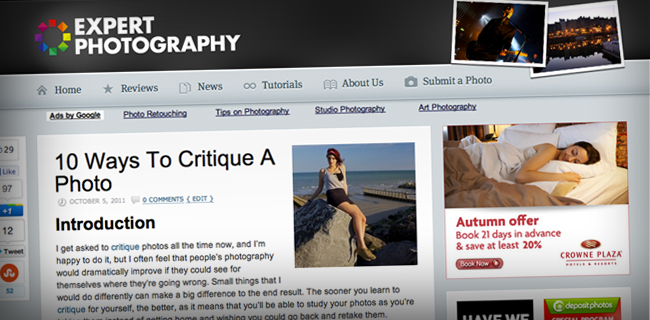
Adverts
This is a schoolboy error that I see all too often. People think that installing ads is going to be a really easy way of earning an extra income for themselves, and while that is often true, it’s not always the case. You see, if you sell cameras, or you’re a plumber looking for work, and you install ads, then it’s very likely that you’re going to be advertising a competitor in the market. You might earn 50c from someone clicking on the ad, but you’re very likely going to lose a sale at the same time. This is a big no no.
On the other end of the scale to advertising competitors, you have sites who are looking to earn money mostly through adverts, and to do so, they install lots of them. There’s a couple reasons why this never works. Firstly, and most obviously, they’re distracting and annoying, and are actually convincing people to install adblock. Keep the ads to just a few, and put them in the right place, and this is a lot less likely to happen. Secondly, by including lots of ads on your webpage, you’re actually reducing their worth. It’s simple supply and demand. If you have three banners next to each other, the bid for those ads is going to be a lot less, because who wants to have an ad which is sandwiched between two competitors? It takes a few weeks, but you should be able to find a compromise that works well for you and your adverts.
Not using WordPress
I don’t want to be bias here, but I can honestly say that I wouldn’t use any other website system. It’s easy to install, customise, and market, and has provided me with exactly the results that I’ve been looking for. The way that you can install free plugins, that do exactly what you want without having to pay for a developer, is a really great feature. What’s more is that I recommend a lot of different plugins to readers, and if you’re not using WP, then these are going to be lost on you. There’s plenty here that you can’t do with Blogspot, or Heaven forbid… Tumblr. To say that the reach of WordPress is substantial would be an understatement, as it’s used by over 14.7% of Alexa Internet’s “top 1 million” websites and as of August 2011 powers 22% of all new websites. If you’re not using it, then I suggest that you start.
"Do Not Write Another Blog Post Until You Watch This Free Video..."
Watch this free video to learn...
- How I got over 10,000,000 people to visit my websites.
- The types of blog post that got me all that traffic.
- How to get someone else to do it for you!




![New WordPress Install – 20 Things You Must Do [Checklist] New WordPress Install – 20 Things You Must Do [Checklist]](wp-content/uploads/2016/09/new-wordpress-install-2016-210x120.jpg)



I like the point on adverts. At first when I designed my website, I wanted to place google adsense thinking that it would earn extra $ but a quick thought came to my mind to leave it and I did. I saw it didn’t qualify because it’s a business site, and to date i don’t regret. Its better to make it clear to your audience what you are offering. It’s here where your consumers will trust you; and will give you the authority to advise them. I like your thoughts on design and fonts. They speak alot.
I agree with you. You are 100% right.
Great post. I would have differentiated ads and adsense, however. I agree about adsense, but with ads you can incorporate them on a site quite seamlessly and earn you a lot more than adsense.
Cheers
Nic
Like your emails and contents.
Awesome Post Josh …Ur 100% Right ..Most Blogger Not Using Ur Ideas!
I totally agree with you about everything in this post. And it all depends on what you want to do with your site. If all you want to do is make money with google adsense, then you should design your site around that. If you want to make money from sales, then I would just leave out the adsense all together.
Very helpful content. Thanks and keep it up.
I would be very careful about design and post frequency. I saw several analysis which confirm following:
1) If the design sucks but content is great, it has very low influence on visitors.
2) Quality articles once a month are better then less quality every week.
3) Design or post frequency actually have only very small impact on SEO. In fact too fast growth of your site might seem suspicious to search engines and result in ban or reducing page rank.
Your point about ads is spot on, I dont have adsense on my site for the simple reason, it makes sites look cheap.
Banner ads are tons better, they look professional and are targeted to your niche. I have seen on so many sites, site owners “prostitute” their sites to make a little bit of money with adsense, I never go back to these sites.
Great post, thanks Josh.
Duane
I agree with you but I am not that tech savy and I hate using wordpress. Of my three sites two are wordpress and one is not and I think the non wordpress site looks the best. WordPress is described as easy to use but my experience has been the complete oposite and now I probably have to hire a web designer that I can not really afford. Ahhhhhhhhhh
Awesome article, Josh. Thats what I’m working on with my site trying to get it just right before i go public with it. I do have a question about this site. The social share button you have to the left of the article, which plugin is this because I’ve been looking for a good one like this. Thnx and keep up the awesome work!
The share bar plugin on this site is called Digg Digg
Micheal and Josh
You guys are doing an amazing job! I am building my blog website and your information has been invaluable. I am so glad I didn’t start before I found out about Word Press thank you for that I bought it and I am working my way through it. I am having trouble putting banners on, but I only started to use a computer last year.
I have installed many on my other sites.
I started a folder and have been putting all your emails in it for reference later.
James L. Kendrick
Ya I apprecite your post. I thing I wanna add is proper time management. One should have a clear routine how much time he’s going to give for what. I think in the initial phase he should give more focus on design then on content and seo. And it’s always not the killer designs that attract people they should feel comfortable to take, what you want to give them. You can take example of craigslist.org
Quote, “You can write the best content in the world, but if you only ever post it once a month on your blog, your website will struggle to do well”. Unquote :
These lines aptly describe me! Well, I will try to improve upon it.
Great post! Thanks.
Thanks for this great post Josh… Really getting fans on my blogs fan page on facebook has really helped me a lot even though I don’t have up to 100 fans yet… I’ll follow your advice on encouraging my blog visitors to like my fan page and follow me on twitter… Thanks once again….
Hi Josh, thanks to this helpful post of advice. I’ve got a website, which is, I am sure, not far from some of your lines. Could you get in and tell me some words for my blog?
Do you have a link to the information about 22% of new websites 2011 is using WordPress?
Sure, http://techcrunch.com/2011/08/19/wordpress-now-powers-22-percent-of-new-active-websites-in-the-us/
though I agree with your suggestion of wordpress, I guess the biggest alluring power of blogspot is its free hosting
I like most of your ideas but I do have reservations about WordPress. While it is a great tool for getting a site up and running quickly, the load times for WordPress sites can be really aggravating. Do you have any suggestions regarding ways to improve load speeds of WordPress sites?
one that gets me is; Content. You can never have quality over quantity or vice versa. I’ve seen so many blogs either have quality or quantity but, never a balanced between the two.
Using WordPress has been on list for the last year, but you’d be surprised at how easy it is to do nothing and stick with blogger because you don’t want to do the work of setting up wp. In the New Year, I must find the time to do it!
I love going to blogs and catching up on the latest stuff but i don’t build and optimize blog sites per’se.
I focus more on creating unique squeeze pages, either way the dynamics remain the same.
It has to be built purposefully, everything being there for a reason.
Design, set-up, structure, should be focused for the audience your going after….
…. elements will always be changing to various degrees. (split-testing)
I was thinking about starting a blog, but I just prefer to build my tribe through email….its more personal.
Ka…Booomm