What to Put on Your Blog’s Homepage
What’s the point of your homepage?
If your homepage simply features a list of your latest blog posts, you’re making a big mistake.
It’s important to get your homepage right because it’s going to be one of the most viewed pages on your blog, but people don’t view it in the way that you’d think.
Who Visits the Homepage?
Before you decide what to put on your homepage, you need to understand who views your homepage and how they got there.
First-Time Visitors
You likely think that your homepage is the first page of your website that somebody sees. That’s probably not the case.
The only way your homepage will be the first viewed page is if another site links to your homepage, if someone tells somebody to go to www., or if you have a well-known brand.
On my blog, 14clicks, only 3.9% of my traffic starts on the homepage.
Second-Page Clickers
What’s more likely is that someone will first see a blog post, then click over to see the homepage. This person has already interacted with your site and they’re curious enough to click over to the homepage.
On 14clicks, the homepage accounts for 28.1% of the second-page traffic, which is 3.6 times more than any other page.
Returning Visitors
If someone found your site once, liked it, and wants to go back to it, they’ll do one of two things.
One, they’ll go directly to the domain. Two, they’ll search for the name of your site. In either case, returning visitors will probably start on the homepage.
On 14clicks, 58% of the homepage traffic comes from people typing in the domain directly or from Google (with some variation of “14 clicks” being 5 of the 6 most popular keywords).
In general, people find your site through a blog post. If they like the post, they’ll click to the homepage. If they return, they probably start on the homepage. Therefore, most people who see your homepage have already interacted with your blog and you need to adjust your content accordingly.
Your Homepage Needs to Answer Their First Question
“Why should I stick around?”
To answer that question, you need to communicate what your site is and who it’s for.
Eye-Catching and Concise Headline
The headline should be the first thing a new visitor sees. It needs to answer the question, “what are the benefits to me personally if I cruise around this blog?”
Put your headline front-and-center so it’s first thing someone sees when they visit your homepage.
Eye-Catching Image or Video
On the side of or below your headline, you need to put an eye-catching, trust-building, benefit-depicting image or video.
The purpose of this image/video is to elicit a positive emotional response while visually communicating what your site is all about. If you have a personal branding blog or a company that’s tied closely to your personality, put a photo of yourself on your homepage to build trust.
Good Example: JustCreative.com
Jacob Cass has a picture of himself and his headline featured above the fold. He also uses his headline to direct people to his portfolio and blog.
Tell People What You Want them To Do
After you tell people why they should stay on your blog, you need to tell them what to do next. Underneath your headline and image, put your call to action. This could be one of four things depending on the purpose and goal of your blog.
Request a Quote
If you have a service-based business and you want to use your blog to collect leads, the homepage is a great place to put a button or a link to your contact page.
Subscribe
If the goal of your blog is to get email subscribers, put an opt-in box at the top of your homepage.
If you’re worried that the opt-in box will annoy your existing readers, don’t be. In the same way that you tend to gloss over ads, once they’re subscribed, they’ll subconsciously scroll past it to the content.
Register or Login
If you have a membership site and your number one goal is to turn readers into users, place two buttons as your call to action: “Register” and “Login.”
Purchase Something
If you want to skip the whole email marketing step and go directly for the sale, not what I’d recommend, then you can make the homepage call to action “See Our Featured Product” or “Shop.”
Good Example: SocialTriggers.com
The sole purpose of Derek Halpern’s site is to turn readers into subscribers. So he puts opt-in boxes everywhere, including at the top of his homepage.
Add Credibility and Social Proof
Once a visitor knows how you can help them and what you want them to do, it’s up to them to make that decision. The best way to help them make that decision in your favor is to demonstrate your credibility through social proof.
Social or Subscriber Counts
People are a lot more likely to subscribe if they know that lots of other people are already subscribed.
If you have more than 1,000 subscribers, show that number directly below your call-to-action. If you don’t, you can show social proof with your number of monthly readers, Twitter followers, or Facebook fans. If none of those numbers are over 1,000, you need to get to work.
Show a Testimonial, Preferably from a Well-Known Source
Another way to build credibility is to feature someone else’s opinion of you and your blog. Ask your most active readers to give you a testimonial and tell them that you’re going to put it on the homepage.
What’s even more powerful is a testimonial from someone who everyone knows. This builds authority by association. But don’t coerce testimonials from people who wouldn’t otherwise read your site.
Press or Customer Logos
If you’ve gotten a lot of press or have worked with well-known brands, put their logos on your homepage. Again, this builds authority by association.
I’m torn whether or not you should link the logos to the articles, though. On one hand, it could build your credibility even more if people read those articles. On the other hand, you’re driving people away from your site right as they’re about to take action. What do you think? Comment below.
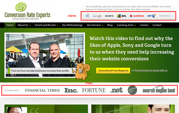
Good Example: Conversion-Rate-Experts.com
Ben Jesson and Dr. Karl Blanks, from Conversion Rate Experts, have worked with the largest companies in the world and their blog has been featured on a number of prestigious media outlets. They make that clear with client logos and press logos (which aren’t linked, by the way).
Regularly Updated Content and Deep-Linking for SEO
From a search engine optimization perspective, there are two important things to consider with your homepage.
One, your homepage should update at least slightly when you post new content. Google likes to see fresh content. Two, every page on your site should be two-three clicks away from the homepage to make sure it gets completely indexed.
Links to Latest Blog Posts
New content on the homepage, even if it’s just the headlines, is important for search engines, but it’s also important for your readers. When people come back to your blog, they’re expecting to easily find your latest content.
This doesn’t mean that your blog needs to be on your homepage. You can choose to use a Recent Posts plugin to display the headlines and excerpts from your latest blog posts.
Deep-Linking and Sitemap Link in the Footer
The best way to make sure that every page on your site is within three clicks of the homepage is to subtly link to your category archives and sitemap in the footer.
This also helps from a usability standpoint if people are looking for posts on particular topics.
Good Example: IncomeDiary.com
As you see, Michael showcases the latest posts on the Income Diary homepage because his goal is for you to consume as much content as possible. The more blog posts you read, the more likely you are to subscribe and buy something from him. In the footer, he links to the sitemap, category archives, a few popular posts, and author archives.
The Final Word
Blogs are different from traditional, static websites because almost everyone who sees your homepage has already seen a different part of your blog.
It’s important to adjust the content of your homepage knowing that they’re already interested in what you have to say. Whether it’s leads, subscribers, or sales, the homepage is a great place to convert people to whatever goals that you set for your blog.
How does this help you see your homepage in a new light? What are you going to do about it?
Read more: ‘7 Quick Tips to Make Your Blog Design More Readable’
"Do Not Write Another Blog Post Until You Watch This Free Video..."

Watch this free video to learn...
- How I got over 10,000,000 people to visit my websites.
- The types of blog post that got me all that traffic.
- How to get someone else to do it for you!


![New WordPress Install – 20 Things You Must Do [Checklist] New WordPress Install – 20 Things You Must Do [Checklist]](wp-content/uploads/2016/09/new-wordpress-install-2016-210x120.jpg)


Hi Nick,
Thanks again for opening my eyes to the many different uses of the homepage!
Every time I learn a little more I discover that there is so much more to learn!
One day I really will master this!
Nick
Yeah, there really is so much to learn, Nick. I’m still learning it myself. I’m not sure anyone will ever master it.
Awesome stuff! I’m currently redesigning a blog at the moment so it really helps to get some great ideas for the homepage.
I’m glad, Niall. Your homepage is one of the most important pages to get right. Based on what I saw a few weeks ago, too many of the readers here have their homepages all wrong.
I know! That’s why this post is awesome!
Thank you :).
Thanks Neil for another great post…
I really need to work on the aspect of regularly updating my blog. Irregularity has really affected my blog and I think its time to work on it…
Thanks for sharing
Thanks for the great advice and the details Nicholas! We have taken a little different approach to our homepage but you certainly bring up many great points to consider. Thanks again!
What do you mean by taking a “little different approach,” Kate? I see a headline, a clear call-to-action, and press logos. Are you talking about a different site?
Good point Nicholas! By different approach, I mean’t not having content on the homepage like most traditional blogs. Thanks for looking at the site and giving your feedback, I really appreciate it!
Sure thing. The first and only page I saw on your site was the homepage. So, in my case, there’s not enough trust built there to get me to subscribe. If the vast majority of people who see your homepage have already interacted with you, your site, or heard about you from someone else, it probably works well. Aside from the SEO benefits, people put links to blog posts so first-time visitors have a chance to research you before you ask for anything. Test and think.
I’ve been looking for ways to re-design my homepage of my website. I definitely gained a lot from this article. I was wondering if you use any plugins strictly for your homepage. Thanks
The Recent Posts plugin is the only one I would use for the homepage, and that’s only if you don’t have your blog as the homepage. Tools aren’t the answer, Brian. The strategy is what matters. If you have trouble customizing your homepage, there are plenty of tutorials out there that’ll show you how. It depends on the theme you’re using.
Great info, thanks. I also think first knowing the goal for your home page is very important so you can decide what goes where.
I agree, Matt. Start with the goal of you website. Then you can figure out the goal of your homepage and make decisions accordingly.
Nic, great write up here. You know, Derek is such an awesome guy when it comes to home page mastery. He came on board not quiet long and he’s everywhere just like Freddy Inn of FPM.
Knowing what to put on your HP will help your brand a lot and tracking visitors as well helps.
Sheyi
Derek is a master, Sheyi. He doesn’t tell too many people, but he’s been doing all of this for a long time. In fact, in the early days of Copyblogger, Brian Clark came to him for help with getting traffic. It’s just that Social Triggers is relatively new.
Great Post! I agree, your posts alone will not get you subscribers. you need to have a well thought out plan and layout that will lead people to assume you are an authority.
Your content is the foundation, Tyler. Once you have consistent, great content, there’s a lot you can do to improve your conversions. I just wanted to shed some light on how great bloggers use their homepages.
Came to your site from your youtube video, great post, and will be sure to follow your suggestions. Thanks
This is a really good article and I just started paying attention to new Google beta analytic’s for percentage of clicks on navigation tabs…very enlightening if you have not checked it out.
So Nicholas, I have a challenge in my niche (non-IM). My customers have a pain they need to fix right away…but I do need to educate – my solution is the most expensive in the niche. So I have taken IM strategy and applied to my website – its a hybrid of IM / e-commerce store. As you can see I use a long sales letter for my “landing page” but its not my home page. I plan to begin testing different landing pages. I do roughly 1% conversion on cold traffic right now.
any thoughts?
Next time I dig into Analytics, I’ll take a look at that, Karl. Any thoughts regarding what? It seems like you’re doing pretty well.
Hey Nicholas,
Loved seeing the stats on how your visitors behave. Our site experiences this also so I’m sitting here reading and nodding my head.
I don’t know if I missed it because I’m in a hurry, and you already answered it here, but it seems to me a great idea for another post is, “What Visitors Should See On Every Page Of Your Blog” which would answer the question of what needs to be present on every page of your blog in order to have the best chance possible of getting first time visitors to do what you want them to.
And if you didn’t cover that in this post but you or someone somewhere else addresses this question I’d love to be directed to it.
Hey Lewis, thanks for the thought. I’ve circled around that question on ID, but haven’t addressed it specifically. I’ll take it into consideration for my next post here.
I want to put a form at the top of my webpage the way Socialtriggers does, but can’t seem to find a wordpress plugin. Do you have any solutions on how to do so?
Hey Ileana, Derek’s homepage opt-in is custom built. No need for a plugin. I see that you use Aweber. You can generate a form through them like you did on your sidebar. Then hook it into the top of your homepage. The best way to do that depends on your theme. You’re using OptimizePress, right? I’m not familiar with James’ theme. Do you know how to add HTML above your blog posts on the homepage? If you can figure that out, you’re golden.
Derek uses what is called the feature box which is baked right into Thesis.
Great stuff ! It opened my eye and I learnt a lot. But what about placing ads on homepage ?
If you’re goal is to get people to click ads, then that needs to be prominent as your call-to-action, Sanjib. Take a look at the Income Diary homepage. Michael does a great job of that.
I think this is why it is so important to have a graphic designer build your homepage. I see too many people including myself in the beginning who try to design the homepage themselves and it looks terrible. I’ve learned if want success online have to invest in a captivating and well designed homepage and overall unique site design. Thanks Nicholas
Great article. The problem I am facing right now is getting subscriber count up as far as RSS. It’s hard as hell.
It was only after I invested a huge amount of time in my homepage that I realized what you pointed out above, that very few people originate on the homepage, or land there at all for that matter.
Enjoyed your post Nicholas