Top 10 Facebook Advertising Mistakes To Avoid
By: Josh Dunlop Topics: Get Web Traffic More posts about: Buying Advertising, Facebook Marketing
Allow me to share a harsh truth about web traffic with you:
Free traffic sucks.
This is something I learned the hard way.
I have over 17,000 fans, and not only is the traffic minimal, but when I get it, the quality sucks.
And I can prove it.
Last week I was running a Facebook ad campaign. Nothing major, just a couple hundred bucks on a free ebook squeeze page.
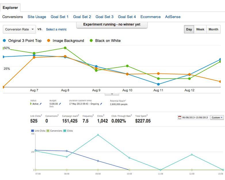
And I’ve just started using OptimizePress 2.0, so I was split testing three different page templates at the same time.
Below is a screenshot of the conversion rate of this split test, over the top of the when I was spending money on Facebook ads.
It’s pretty clear from that image that when I paid for high quality, targeted traffic from Facebook, the conversion rates on my squeeze pages went up.
Way up.
We’re talking the difference between 10-20% and 40-50% conversion rate.
If you have something to sell, then you need to send quality traffic to it if you ever want to make any money from it.
So long as you’re seeing a positive return on investment from your ad spend, you can ramp up your ad spending, and watch your profit increase.
Today I’m going to help you get a positive return on investment by pointing out the top 9 mistakes that Facebook advertisers make.
Avoid these and you will be well on your way to turning a profit with Facebook advertising.
#9 Targeting Your Fans
Your fans already know you, they know what you have to offer; you don’t need to advertise to them.
They’re your fans, so if you want to reach them, just create a status update.
Offer them something good for free to that it gets shared and liked and commented on, and then when you’ve got their attention with that, you can then sell to them.
The only time I ever advertise to my fans is when I’m having a sale on a product, and that’s usually in the form of a promoted post.
#8 Not Setting Clear Goals
I can’t believe how often I see this.
Ask yourself a very simple question when you set up your Facebook ad. “What do I want to achieve with this ad?”.
More sales?
More opt-ins?
More free sign ups?
Whatever you’re advertising has to have a goal which is ultimately going to make you money. Don’t bother with page views if they’re not going to make you any money.
#7 Choosing The Wrong Landing Page
Don’t advertise your Facebook page, or blog post.
This is a just a great way to burn through piles of money.
Fans look great, they’re social proof, and they make you feel good, but they don’t do a whole lot to your bottom line.
And that’s what it’s all about – making more money.
You need to choose a landing page that will make you money somewhere down the line.
Advertise your products, or a squeeze page. This way you will either make a sale, or gain a new lead, which you can sell to in the future.
This ties in nicely with setting the right goals.
#6 Broad Targeting
Facebook allows you to be really specific about who you target, so pay careful attention to this.
You can target people based on age, location, gender, sexual preference, language, education, interests and more.
The most important of those is interests.
I’m going to use myself as an example here.
My target market is beginner photographers, but it would be a big mistake to go into Facebook and choose people whose interests are ‘photography’.
Why?
Well, because my mum likes photography, but has no interest in learning about it.
You need to be much more specific than that.
What I do is search for entry-level camera models that I know amateur photographers use. Canon EOS 550D, Nikon D3200, etc.
If someone has listed these as one of their interests, then they’re likely to be amateur photographers.
Think carefully about who the people your targeting are, and what their interests may be.
#5 Weak Ad Images
I’m a photographer by trade, so I’m pretty good when it comes to creating images that get attention.
When it comes to images, we are drawn to those with the strongest ‘visual weight’, as it’s known in composition.
We’re naturally drawn to certain elements in a frame, and I’m going to list the top three now, so that you can use them to get your ad clicked on.
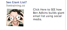
First and foremost is human eyes. Whenever we talk to someone, or look at someone (for the most part), we look into their eyes. If you look at a photo of a person, whether you realise it or not, this is where your eyes are drawn.
And remember, you’re competing for attention on the sidebar, against 4-5 different ads. Yours need to stand out the most, so adding a human element to your sidebar is a good idea.
The ad below has been in my sidebar for months. It wouldn’t be if it wasn’t still converting.
The next most powerful visual weight is size/color/contrast. Something that stands out in the frame.
This is a little harder with the limited space you have on Facebook, as you can’t really create anything too big.
If it was just a big orange box (not sure if that would be approved), it would certainly stand out, but it doesn’t really advertise what you’re selling, so bare that in mind.
The third most powerful visual weight is writing. Specifically the ABC alphabet. We’re naturally interested by writing, and want to read it, so we’re drawn there quite easily.
So there’s a brief introduction to visual weight, for more information on how to create ads that get clicked on, keep reading.
#4 No Clear CTA
I see this time and time again, and I’m going to show you a couple examples.
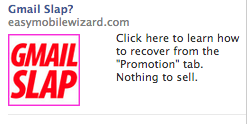
Which text do you think drives more people to click on the ad, this one:
Or this one:
The second one, clearly.
It doesn’t just say what it does, it commands you to click on it with ‘Click here’.
#3 CPM Rather Than CPC
CPM stands for cost per thousand impressions (M being the roman numeral for 1,000). CPC stands for cost per click.
You want to use CPC bidding, because then you can control the price of your bid. It will save you money in the long run as you will never go over that price.
You see, as your ad starts to get older, and people have seen it a few times, they’re less likely to click on it. They become blind to your ad. But this doesn’t mean Facebook will stop showing it, which ultimately results in you getting less clicks for your 1,000 impressions.
#2 Using The Suggested Bid
This scared me when I first started using Facebook Advertising.
I entered in exactly who I wanted to target, and Facebook told me that my suggested bid was 67c. When I ran the campaign, I was only paying 13c a click.
Don’t be put off by Facebook’s suggested bid, which tends to always be grossly exaggerated.
#1 Not Tracking
How are you supposed to know if your marketing efforts are working if you’re not tracking them?
There’s countless tools on the market for tracking, including Google Analytics, which is completely free. You’d be a fool not to track everything you do.
In internet marketing, there’s two things you should be doing. Always be tracking, and always be testing. That way you will get the best possible results, and know how you should move on.
If something’s not working for you, it’s important to know about it.
Read Next
-
How I Get Over 100,000 Visitors a Month With Top List Articles -
10 Article Headline Examples That Got Us 10 Million Readers -
How To Promote Your Blog – The Fastest Way To 1000 Visitors Per Day -
7 Lessons From 50 Blog Posts That Send Me The Most Traffic -
10 SEO Blog Post Publishing Steps that Most Bloggers Forget -
The Beginner’s Guide to Seeing Massive Pinterest Traffic -
25 Best SEO Tools For Successful Blogging -
9 Reasons Why You’re Not Getting Search Engine Traffic
"Do Not Write Another Blog Post Until You Watch This Free Video..."
Watch this free video to learn...
- How I got over 10,000,000 people to visit my websites.
- The types of blog post that got me all that traffic.
- How to get someone else to do it for you!
Where should I send your video?
Please enter your email addressHow We Get Over 64.73% Of New Email Subscribers
We first added a popup opt-in box to IncomeSup back in 2010. Today, it gets us more subscribers than our homepage opt-in, footer opt-in, sidebar opt-in and squeeze pages combined.
After seeing how well it worked for us, we decided to develop it into a plugin our readers could use. It's been so popular that over 60,000 websites now use it!
Click Here To Get Instant Access


You are on point brother – some of the facebook marketing mistakes we make do more harm to our efforts
Amazing tips, all worth of a course. In the images tip I would also include using list images, for example if you are promoting a make money course use an image that vertically shows 1,2,MONEY (instead of 3) and use strong background colors (green in this case since it’s about money) and gradually decrease the tone of the background color with the countdown… This has been an incredible boost to my ads conversions…
Keep up the good work guys great stuff.
Borja