30 Great Examples of Mobile App Design
Mobile app design is not like web design.
Sure there’s color theory, setting type, and maintaining grids, but there’s so much more to consider when the device changes.
To shed some light on the do’s and don’ts of mobile app design, Tomas Laurinavicius to lay out his best practices when designing for mobile devices.
Tomas is a freelance designer and the co-author of Mobile Design Book.
Enter Tomas:
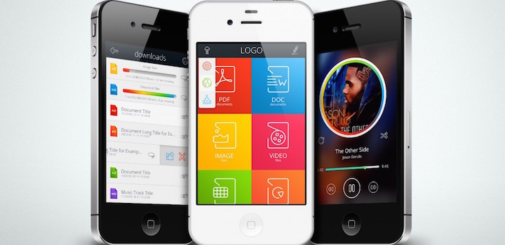
In this article I would like to share some examples of great mobile app designs. Specifically, the elements that come together to make a great app.
Launch Screen
The launch screen will be seen by every single app user and will last for a couple of seconds, however it’s crucial to make a good first impression and set some expectations.
Use a background image that tells something about the app, make it clean and well-branded. Keep the size of your launch screen to a minimum to cut down on load time.
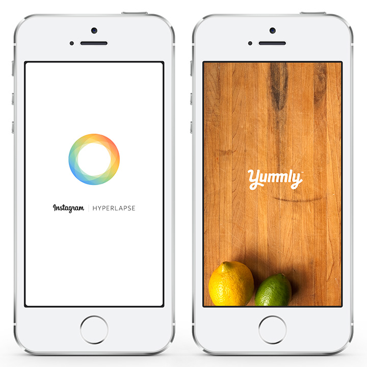
Hyperlapse from Instagram & Yummly
Empty States
When a user first downloads your app, they won’t have any data to see. This is called an empty screen.
At this point you need to explain the purpose of your app and guide them towards using your app for the first time. Otherwise they’ll leave confused and might never come back.
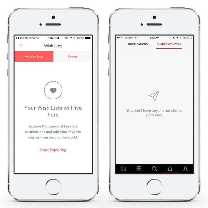
Airbnb & Flipboard
Login screens
Forget usernames. Use email address instead.
Make the login process easy by giving them the option to login with existing platforms. Depending on your audience, it may be Google, Facebook, or even LinkedIn.
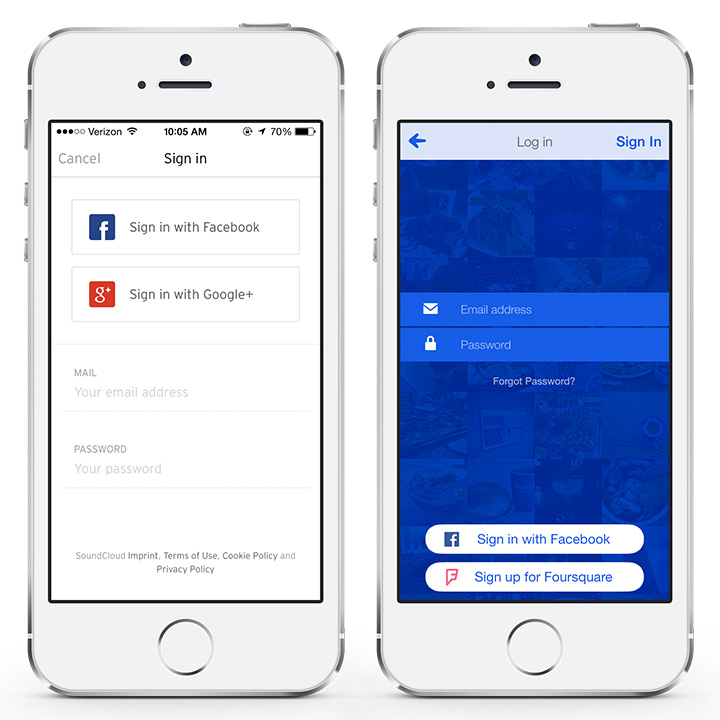
SoundCloud & Foursquare
Activity Feeds
When designing an engaging and immersive activity feed, consider context and use gamification principles.
Provide essential data like date, time and location if appropriate. To make it more like a game, use numbers, call to action buttons, and little icons to make the interface more appealing.
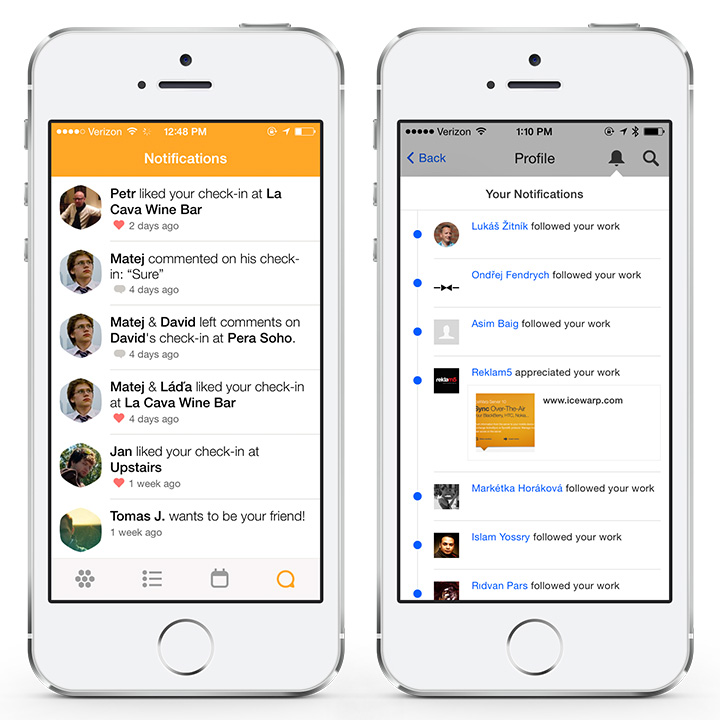
Swarm by Foursquare & Behance
Signup Screens
If your sign up process is complex, users will leave.
Simplify it as much as possible. Include only the necessary information and even suggest using other networks that store user information like Facebook or Twitter.
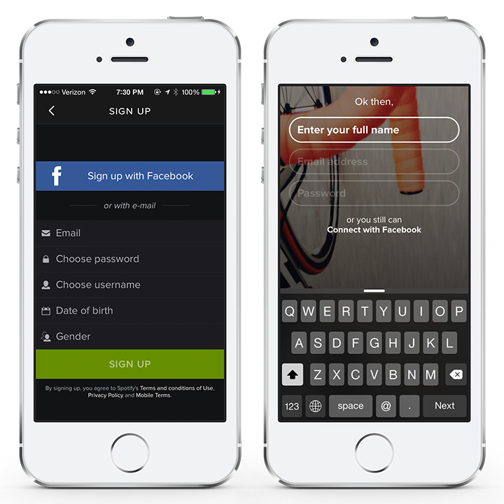
Spotify & Cirqle
Checkout
Checkout is a tricky feature to design in mobile apps.
It has to present a lot of information at a glance and allow some guidance towards the next step. Prioritise the data and break it down into chunks that can be presented in groups.
For example shipping address and payment information can make up two groups, pricing and discounts another group and so on. Organise your process so you don’t overwhelm your customers.
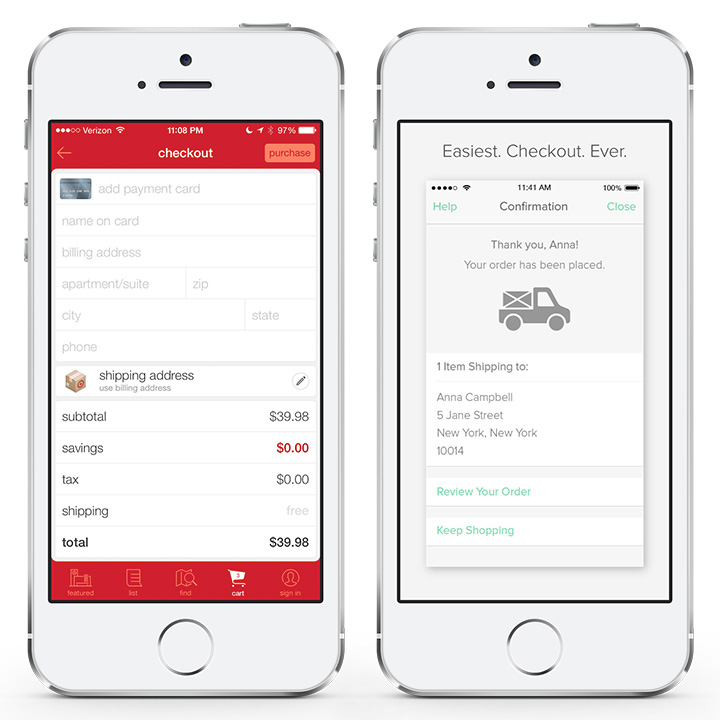
Target & Keep Shopping
Comments
Comments are good for building community or simply to show other users that your app is worth joining.
When designing comments, readability and context (i.e. profile pictures, names, and dates) are the most important factors to provide a “live” looking app community ecosystem.
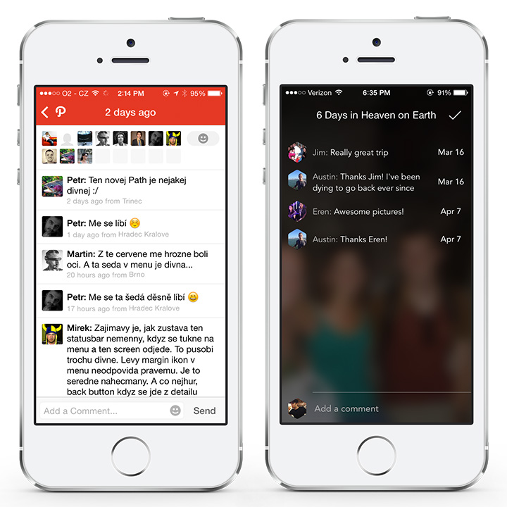
Path & Tripstr
Search
Search is an essential feature for user-generated-content and other data heavy apps.
Provide context and smart suggestions to improve user experience and delight the user. Adding relevant filtering options can significantly improve the search process and lead to customer happiness.
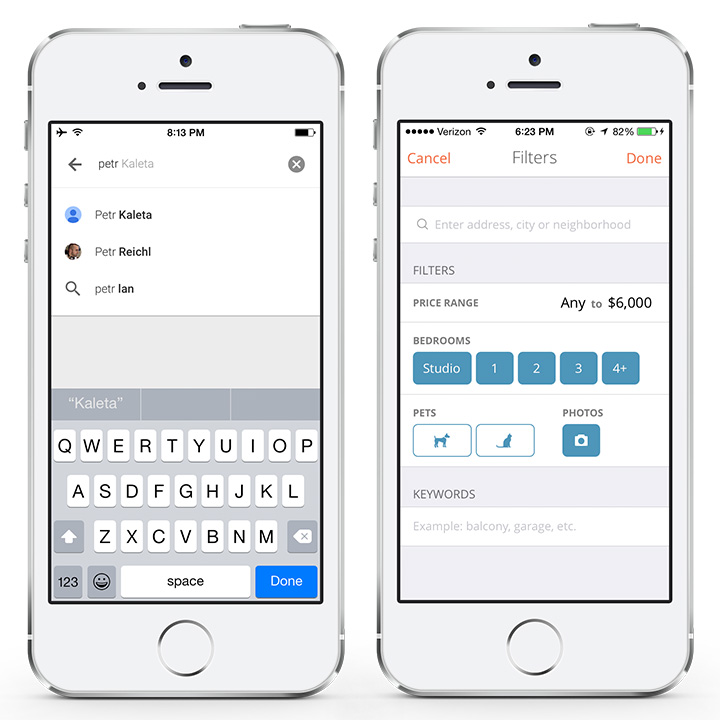
Inbox by Gmail & Lovely
Sharing
Sharing is an important feature for any app as it allows users to spread the word about your product.
Make it easy to share your app or content from it by adding obvious sharing icons and allowing quick sharing across different networks.
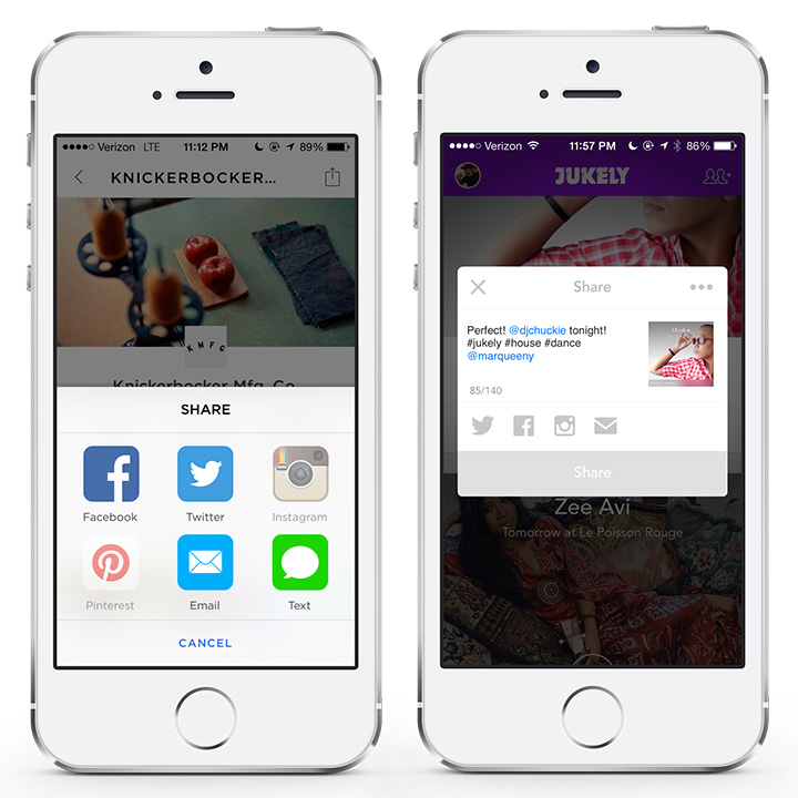
Spring & Jukely
Readability
Readability is tricky on small devices. It’s easy to make type too big or too small.
Focus on contrast, type size and line-height. Ensure that your type is optimally sized and is easily legible. Black text on a white background is good.
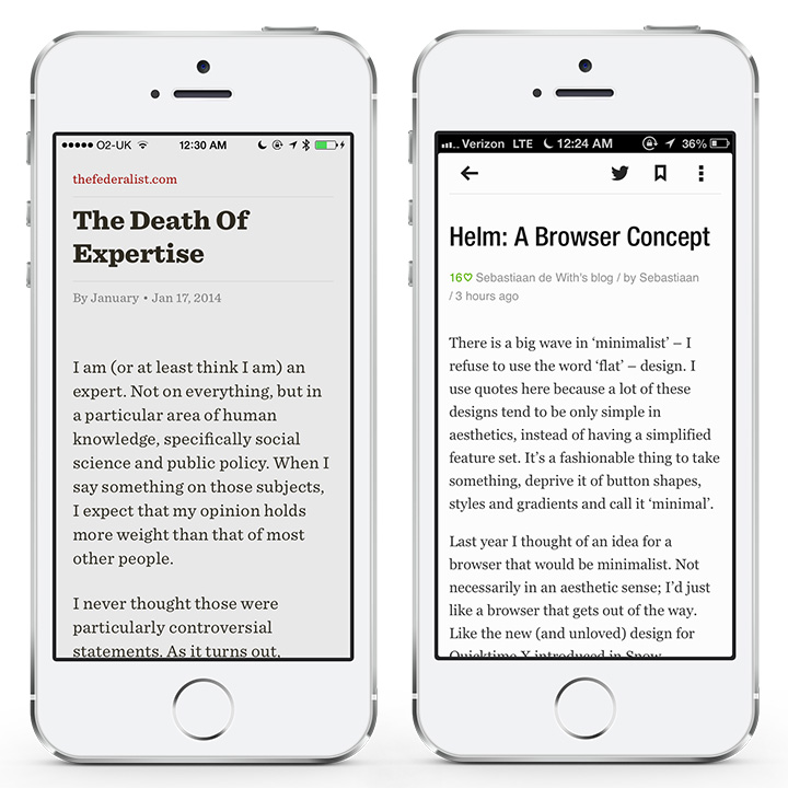
ReadabilityTM & Feedly
Navigation
Navigation is extremely important for any kind of app.
Make it easy and understandable for different segments of your audience. Use simple copy so users are familiar with the navigation jargon from other apps. Utilize icons and negative space to give some context for your navigation and only include the necessary links.
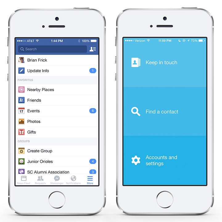
Facebook & LinkedIn Connected
Settings
Settings screens are often overlooked because they’re not exciting, but it’ll be one of your most-used screens.
Use icons, separate different setting groups with dividers or negative space, and help users navigate quickly to decide what to do next. Also, provide quick options by using native toggle buttons so users can save taps.
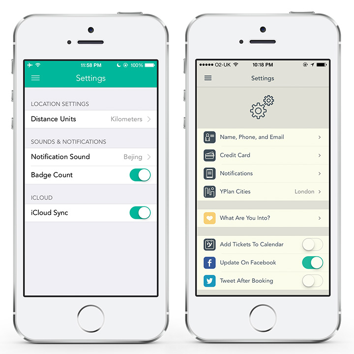
Checkmark 2 & YPlan
Notifications
Notifications are the reason users keep coming back to your app.
Make these notifications obvious but not too annoying. People need to know what is going on but don’t want to be overwhelmed. Provide subtle color indicators and numbers to portray the things that are new.
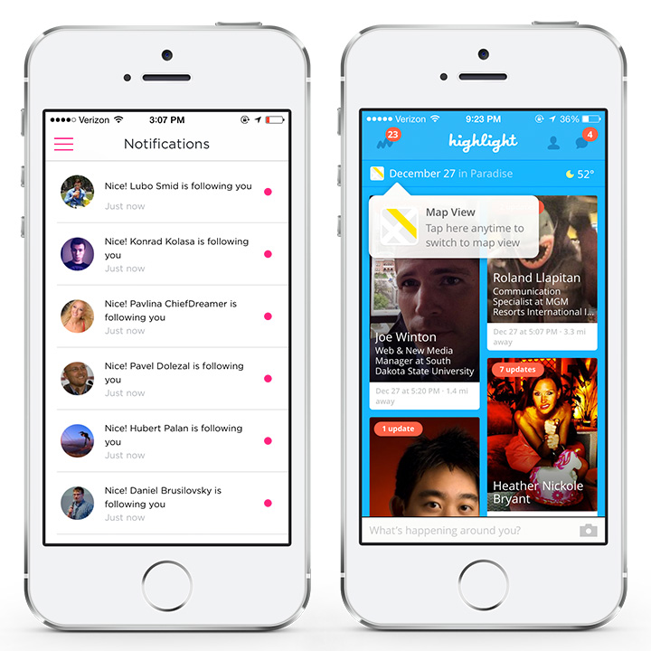
Gogobot & Highlight
Messages
Messaging or chat functions are also a common feature. When designing a messaging system, it’s all about communication and context.
Optimise type size so users can read longer messages and include the date, time of posting, location and other information that’s relevant.
Messaging is all about multimedia nowadays. Provide users with an option to communicate adding photos, video, sounds, smileys and old school text.
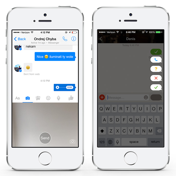
Facebook Messenger & Path Talk
Profile
Many apps allow users to create an account and store stories or activities around that profile.
Whether it’s social media, shopping, or any other app, it’s crucial to make profile pages clear and appealing to users.
Emphasize user profile photo and their name. Also provide relevant information and stats so people can see how active or respectable the user is.
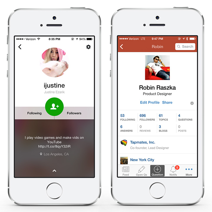
Frontback & Quora
Conclusion
As you can see from all the apps I’ve listed, there’s a lot to consider and master when designing a winning app.
While anyone can design an app, it’s important to hire a designer that has experience in the field and can apply all the knowledge and best practices.
Little things can make or break your app. Don’t risk your time and money by hiring someone who doesn’t understand the intricacies of designing an awesome app.
"Do Not Write Another Blog Post Until You Watch This Free Video..."
Watch this free video to learn...
- How I got over 10,000,000 people to visit my websites.
- The types of blog post that got me all that traffic.
- How to get someone else to do it for you!


