20 Best Designed Facebook Fan Pages
By: Nicholas Tart Topics: Get Web Traffic More posts about: Facebook Marketing, Social Media Marketing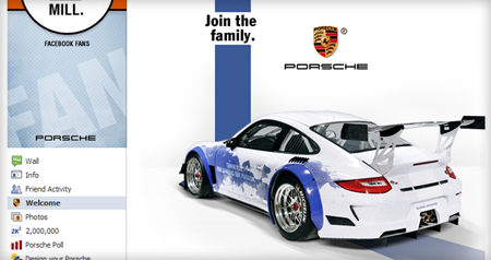
The original intent for the Facebook fan page was to get non-fans to click the Like button.
Most welcome pages still exist primarily to fulfill this purpose, but large companies have started to dabble with more creative uses of the almighty welcome page.
You can have an affordable and high-end web designer or developer get more out of your welcome page by visiting AwesomeWeb.com
Here’s 20 of the best designed Facebook fan and welcome pages in terms of how well they convert and how creatively they’re promoting their brand.
Bob Marley
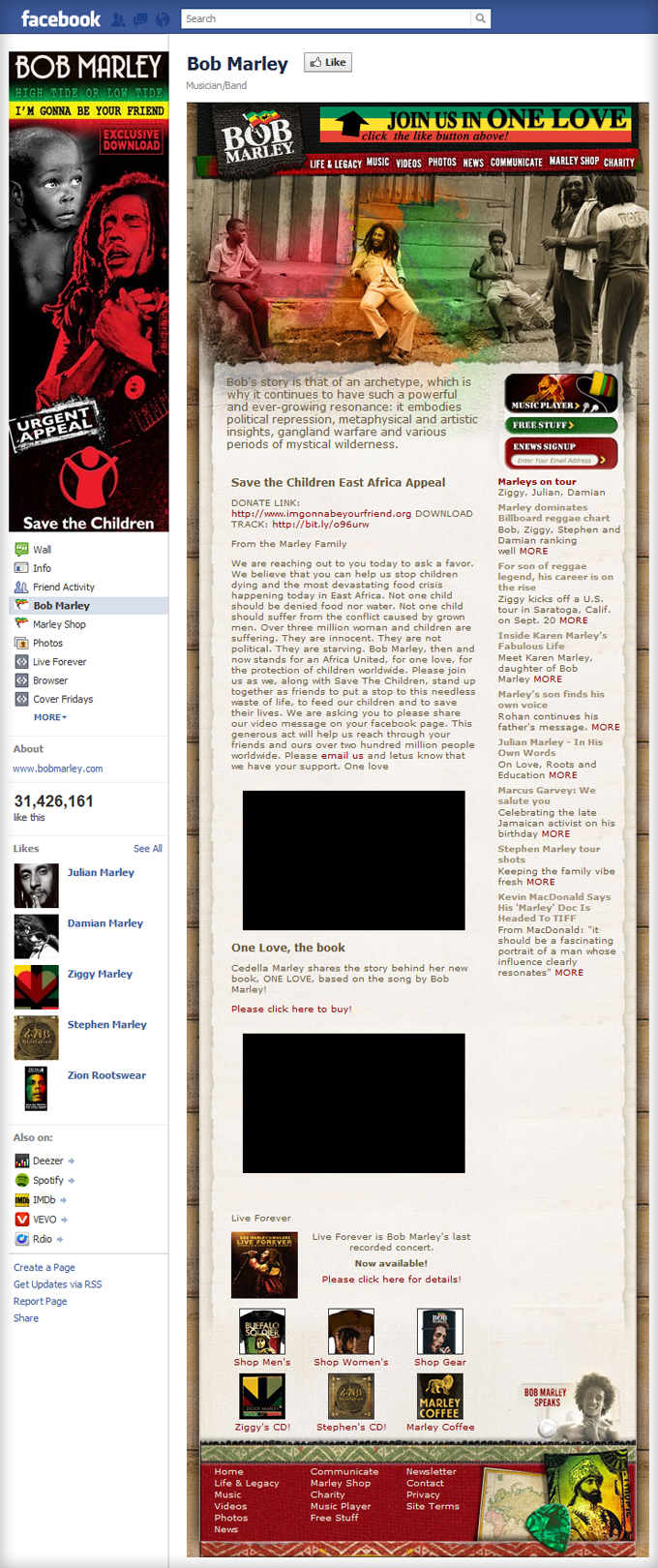
I included the Bob Marley welcome page because it doesn’t ask you to “Like” Bob Marley. It asks you to join a movement that Bob Marley dedicated his career towards promoting, “One Love”.
Coca-Cola
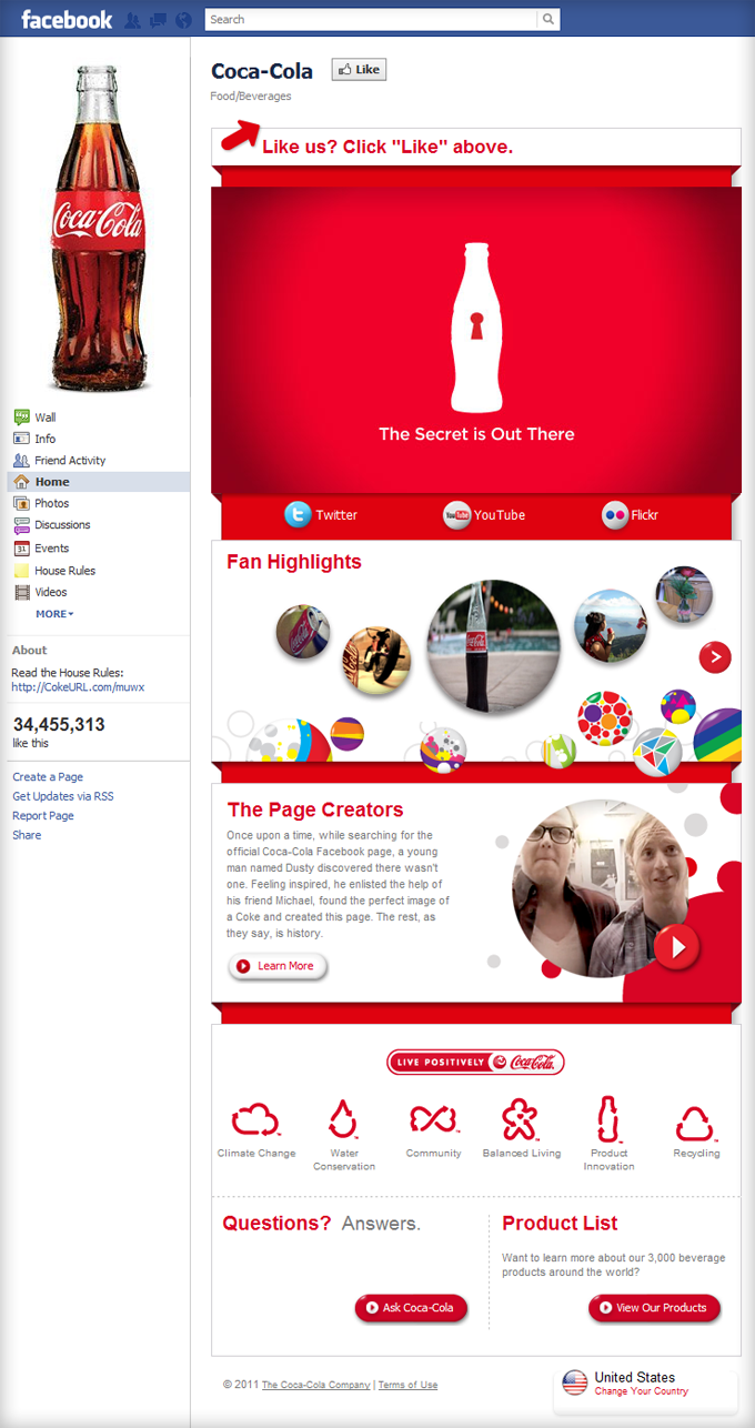
The Coca-Cola fan page emphasizes the “Like” button with a simple, 5-word call-to-action. It coincides with their latest “The Secret is Out There” YouTube campaign and they creatively incorporate fan photos as well.
Cranium
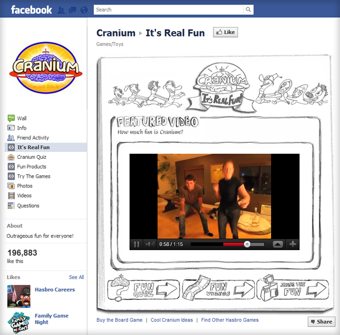
What better way to promote a board game than to showcase YouTube videos of real people playing the game and clearly enjoying themselves? This isn’t Cranium’s welcome page, but it’s a creative use of pages to help promote the fun nature of their brand.
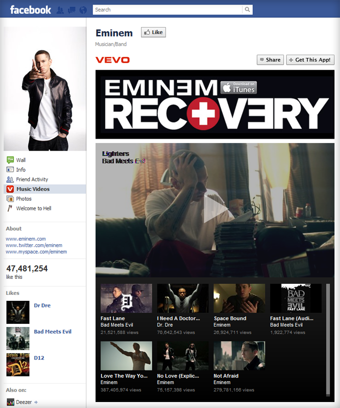
Eminem
Eminem is the second most-liked page on Facebook (behind, you guessed it, Facebook). It spotlights his latest music videos, but before you can play them, you need to “Like” the page.
Gary Vaynerchuk
If you read IncomeSup, you probably know Gary. But most people don’t. So the first question his Facebook page answers is, “Who is Gary Vaynerchuk?” It’s a creative way to tell Gary’s story as well as make you think, “This guy is worth becoming a fan of.”

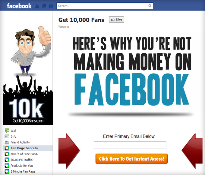
Get 10K Fans
Brian Moran’s Get 10,000 Fans is one of the world’s most interesting Facebook case studies. His welcome page is simple, highly effective, and you get the sense that it’s the tip of the iceberg as far as how much there is to learn from him and his page.
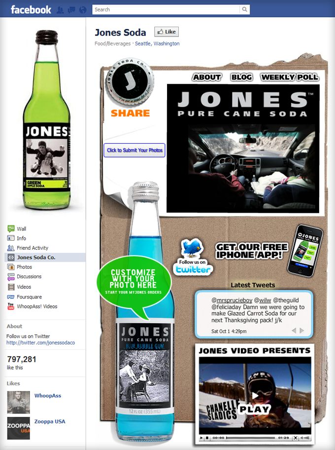
Jones Soda
The Jones Soda welcome page is simple, well-designed, and captures the essence of the brand they’ve been building for 24 years.
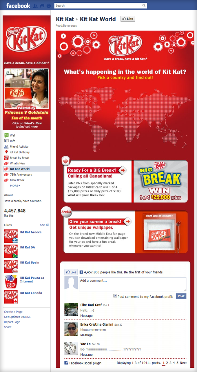
Kit Kat
Kit Kat is one of the few brands that creatively highlights a “Fan of the month” in their profile picture. They’ve also integrated the Facebook Comments plugin within their fan page to capture their visitors when they scroll to the bottom of the page.
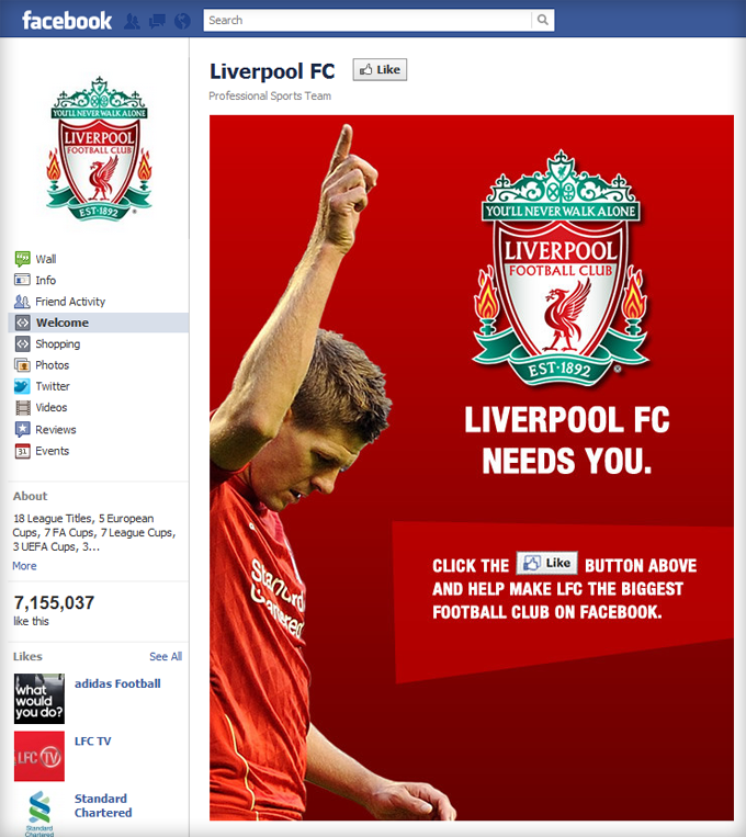
Liverpool FC
Most fan pages use arrows draw attention to the Like button. Liverpool FC, however, uses one of their players to point out the button.
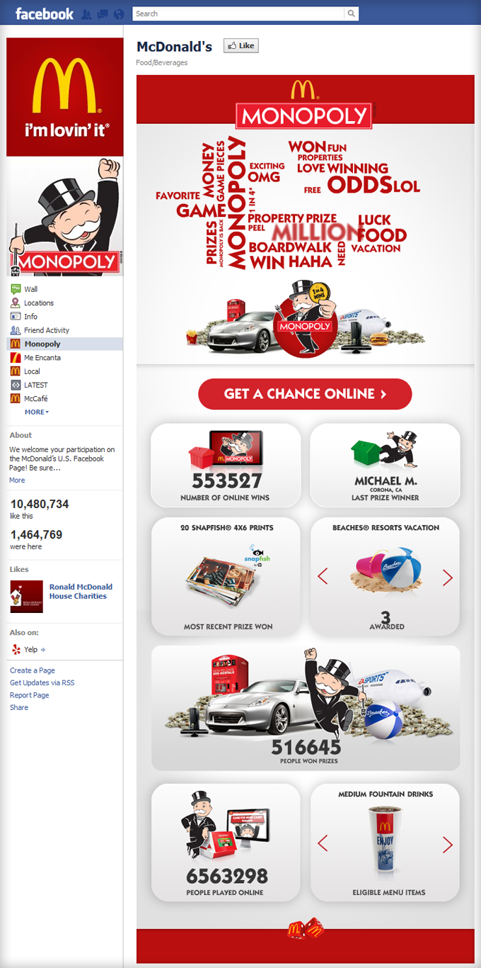
McDonald’s
McDonald’s uses their welcome page to promote their annual McDonald’s Monopoly game by trying to get you to play online as well.
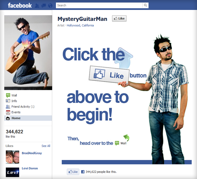
MysteryGuitarMan
With 344,000+ fans, MysteryGutiarMan is one of the most-liked, non-celebrity people in the world. Partly because of how simple his welcome page is. Notice that he included another “Like” button at the bottom.
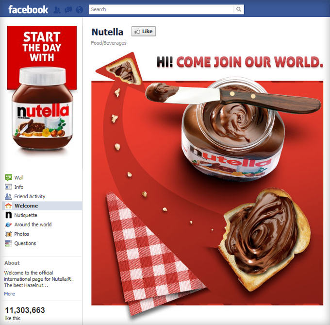
Nutella
Nutella’s fan page is my favorite of the bunch. The product looks delicious, the arrow points directly to the “Like” button, and “Join our world” makes me want to know more about their world.
Porsche
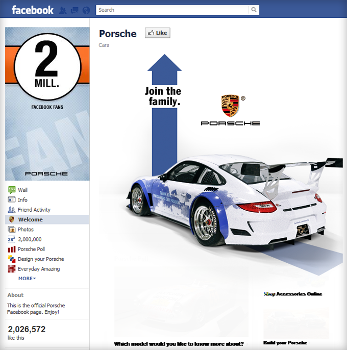
Porsche’s Facebook page is simple on the surface but they subtlety include transparent images below as though, “once I click ‘Like’ I’ll be able to see what those images are.”
Pringles
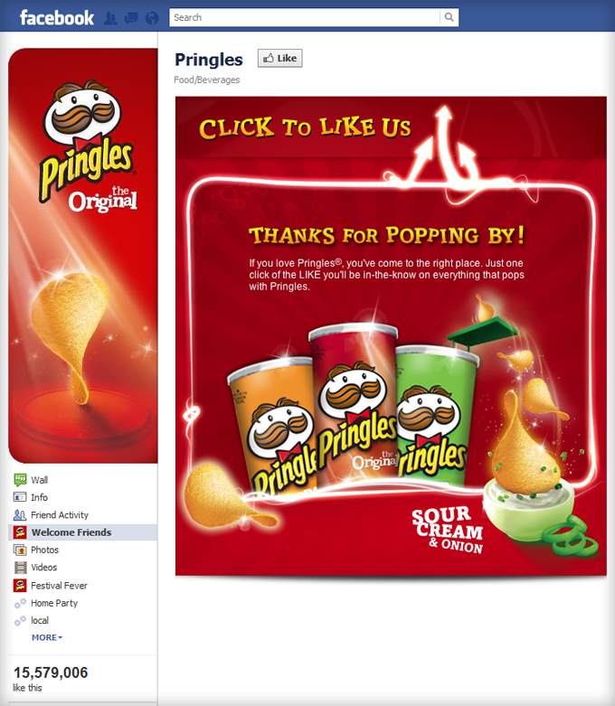
Pringles has one of the older Facebook welcome pages in this list. All the sparkles make it exciting.
Red Bull
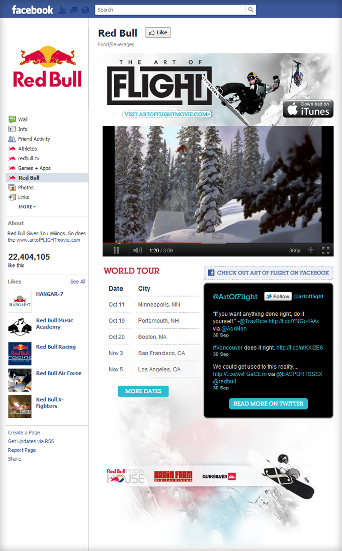
Red Bull uses their welcome page to promote an extreme sports movie they’ve created called, The Art of Flight. The trailer is as captivating as their brand.
Skittles
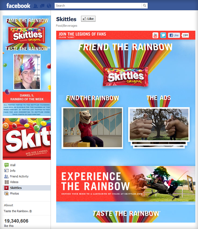
In terms of design, I think the Skittles Facebook page takes the cake. Similar to Kit Kat’s Fan of the month, they have a “Rainbro of the Week.” It’s well-designed, well-branded, and makes them seem cool.
Starbucks
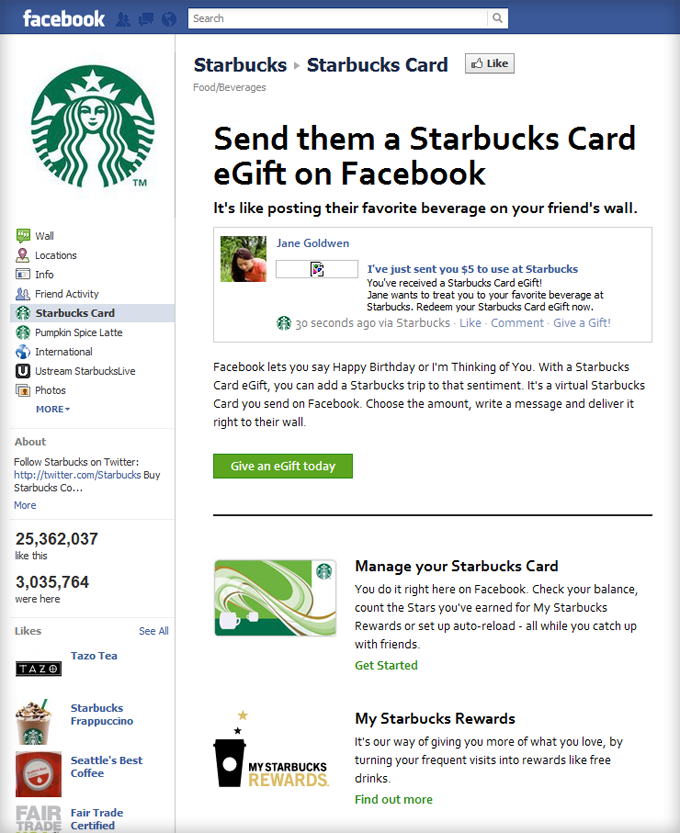
The normal Starbucks welcome page is used to promote their latest drinks and specials. But below you’ll find a page where you can send Starbucks eGift Cards to your friends through Facebook. I think we’ll be seeing a lot more of this in the near future.
Starburst
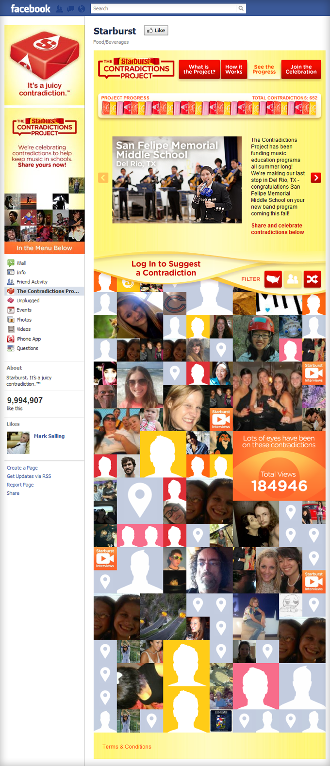
Starburst uses their welcome page to promote the Contradictions Project which is aimed at keeping music in schools.
Windows
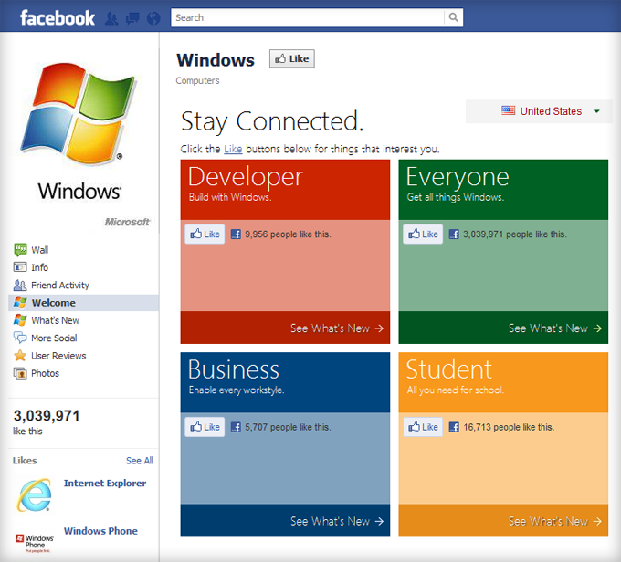
What? Windows made a “Best Designed” list? Yep. Not so much because of the graphic design, but because of how they segment their audiences so they can capture up to four new fans with one welcome page.
Zappos.com
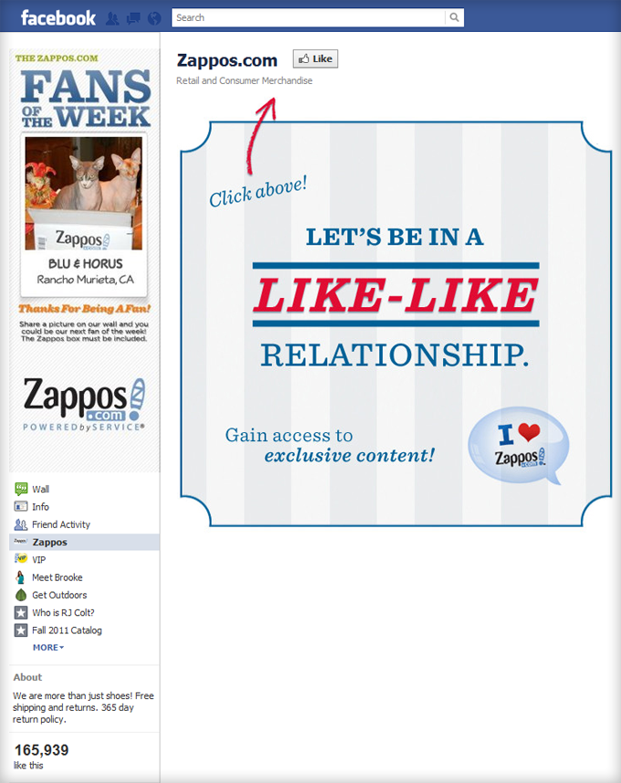
The Zappos.com fan page is simply gorgeous.
3 Common Facebook Page Elements
Looking back at these examples, I noticed three common elements between most of the pages.
- Arrows – Arrows direct your eyes to the most important part of the page, the Like button.
- Red – 12 of these 20 pages use red as the primary color to grab your attention and create an exciting sense of urgency as though you’re going to miss out if you don’t “Like” the page.
- Like vs. Join – “Like” implies a one-time encounter while “Join” involves commitment to the brand/movement. You want people to join you, not just like you.
I hope I’ve inspired and enlightened you as far as what makes a great Facebook fan page design.
What other welcome pages are you a fan of?
Read Next
-
How I Get Over 100,000 Visitors a Month With Top List Articles -

10 Article Headline Examples That Got Us 10 Million Readers -
How To Promote Your Blog – The Fastest Way To 1000 Visitors Per Day -
7 Lessons From 50 Blog Posts That Send Me The Most Traffic -
10 SEO Blog Post Publishing Steps that Most Bloggers Forget -
The Beginner’s Guide to Seeing Massive Pinterest Traffic -
25 Best SEO Tools For Successful Blogging -
9 Reasons Why You’re Not Getting Search Engine Traffic
"Do Not Write Another Blog Post Until You Watch This Free Video..."
Watch this free video to learn...
- How I got over 10,000,000 people to visit my websites.
- The types of blog post that got me all that traffic.
- How to get someone else to do it for you!
Where should I send your video?
Please enter your email addressHow We Get Over 64.73% Of New Email Subscribers
We first added a popup opt-in box to IncomeSup back in 2010. Today, it gets us more subscribers than our homepage opt-in, footer opt-in, sidebar opt-in and squeeze pages combined.
After seeing how well it worked for us, we decided to develop it into a plugin our readers could use. It's been so popular that over 60,000 websites now use it!
Click Here To Get Instant Access

Basically I’m not impressed easily but I promise this post impressed me in a minute!!! You’re my Idol so not from yet as well as I’m following you Micheal for a year also so I’m highly recommending anyone to you to follow.
Superb list!Thanks guys for making a difference on how we make use of social platforms to our advantage,promoting our brands.
Hey, thanks! I was researching about this just this weekend, for improving our page. Great selection.
It’s funny how that happens, huh? I’m glad we could help, Carlos!
Definitely food for thought. Excellent presentation.
I think Microsoft Africa’s is pretty cool.
http://www.facebook.com/MicrosoftAfrica
Yep! Much better than the Microsoft one here.
Agreed! It’s hard to find the brilliantly designed but smaller pages. Thanks for mentioning it Gary!
It is very cool. Nice find. Good use of the Metro UI
Awesome List! I’m watching the 10k Facebook fan video right now and it’s so useful! Thanks!
Sweet! Thanks for taking action with this post, Cheryl. That’s always Michael’s goal. It’s nice to know when a post inspires someone to simply do something.
Great list Michael, very inspirational. Now I know what I can advise my clients! Thanks!
This is a truly amazing list and shows how truly talented some people are.
It’s great to see the big companies catching the FB bug.
Hey Joshua… Yeah, it’s good to get confirmation from big companies on things we’ve been doing for years prior.
Those are all well designed pages and it just proves you that design does play a big role in anything online
Yeah, I think the era of “design doesn’t matter” is quickly ending. It’s just one more way to stick out in the crowd.
Those are some pretty fancy fan pages. I know a company that can help with that, but they increasingly charge more as you gain more fans.
But Facebook traffic is probably better than Google, so it might be worth the investment to get a fancy page.
Hmm… Why do you think Facebook traffic is better than Google traffic, Kent?
Hey Nicholas,
This is indeed a great list…The “like” button has a huge influence on the internet so it’s important to get enough people to hit it.
Thanks for the post.
Hi Nicholas, this is a great list! I’m looking for a design to help me design a facebook fanpage for my site. Do you have any suggestion?
Hey Tung… I would subscribe to Brian Moran’s Get 10K Fans. Designing a fan page isn’t as simple as it should be. His videos helped me to create mine.
Some very creative facebook fan pages there! It’s given me some ideas
Great post, and amazing examples of Fan Pages. It almost makes me sad because I KNOW my fan page needs a LOT of work now;)
Ahh… That’s the trouble with learning! We realize we have a long way to go, but you can’t make that journey without knowing how to get there.
Dude…Nice post!
I’ve bookmarked it. tweeted it and sent it to all my friends who use Facebook for business
Thanks
Mark
Excellent Nick! I came to read this post with very little knowledge of the Facebook Fan Page. Now I have a very clear idea of not only what it is, but how it’s done right. Very well covered topic, thank you!
You’re welcome, Jeremy. I’m glad I could help ;).
Excellent Post! Now I have a general idea to make a successful fanpage ! Thanks again Nick!
How and where are these facebook welcome pages designed?
Impressive list, but personally I don’t like the Starburst’s page design, it’s just too crowded I think.
I agree with Ray Joshua, it is Crowded a bit. I love this post because it really does show what a great page page looks like to promote your business. People need to be on facebook fanpages simple because, thats where the customers are. Simple as that. These are great examples to look at and learn from!
Great job Nicholas Tart! Have a great day!
Thankyou for sharing Sun Damaged to “Sun Virgin”! with us keep update bro love your article about Sun Damaged to “Sun Virgin”! .